Download updated Universal Windows Platform Tutorials in PDF format as they’re published at the following new website for Tutorials

Download updated Universal Windows Platform Tutorials in PDF format as they’re published at the following new website for Tutorials

 Setup and Start |
 Acrylic Material |
 Reveal Highlight |
 ParallaxView Effect |
 Connected Animation |
 Lucky Wheel |
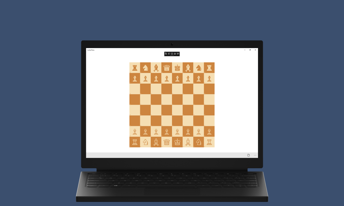 Lucky Chess |
 Reversi |
 Mahjong |
 Racer Game |
 Emoji Game |
 Tiles Game |
 Yatzy Game |
 SvgView App |
 360View App |
 FileView App |
 ZuneView App |
 Pomodoro App |
 Dictates App |
 Analysis App |
 Learning App |
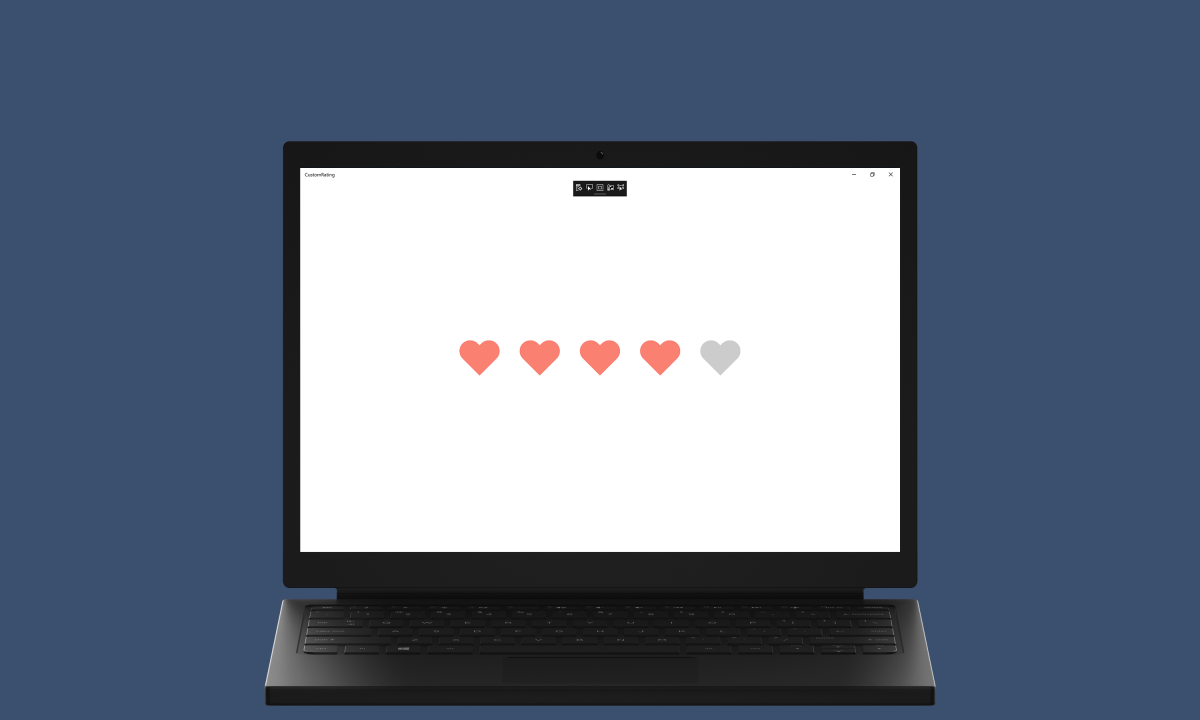 Custom Rating |
 Colour Picker |
 Content Link |
 Pull to Refresh |
 Donut Control |
 Stick Control |
 Ruler Control |
 Split Control |
 Timeline |
 Chaseable Tiles |
 Adaptable Toast |
 Adaptive Card |
 Input Dialog |
 Access Keys |
 Light Effect |
 Shade Effect |
 Lucky Dominoes |
 Lucky Roshambo |
 Deal or Not |
 High or Low |
 Codes Game |
 Flags Game |
 Chase Game |
 Slide Game |
 GifView App |
 PdfView App |
 JpgInfo App |
 ZipFile App |
 Operator App |
 Speaking App |
 Calendar App |
 Contacts App |
 Custom TextBox |
 Custom ComboBox |
 Matrix Control |
 Lights Control |
 Stacked Control |
 Directs Control |
 Uniform Control |
 Docking Control |
 Badges |
 Tile Styles |
 Toast Styles |
 Database |
 Custom Dialog |
 Navigation View |
 Drag and Drop |
 Photo Rotate |
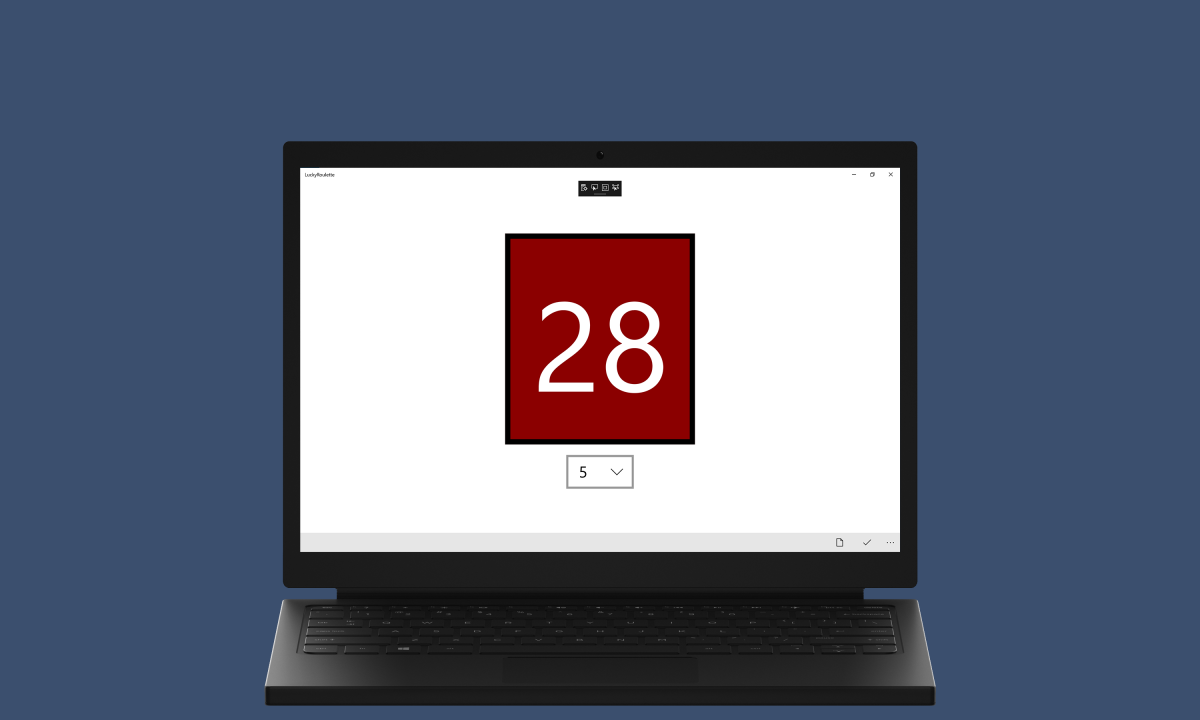 Lucky Roulette |
 Lucky Bingo |
 Hit or Miss |
 Four in Row |
 Fruit Game |
 Light Game |
 Order Game |
 Sound Game |
 Appointment App |
 Cryptograph App |
 Compression App |
 Recognition App |
 Tailored App |
 Adaptive App |
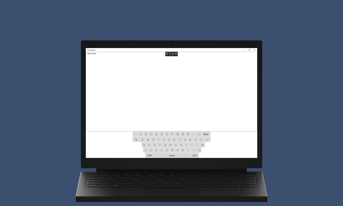 Keyboard App |
 Jsonfile App |
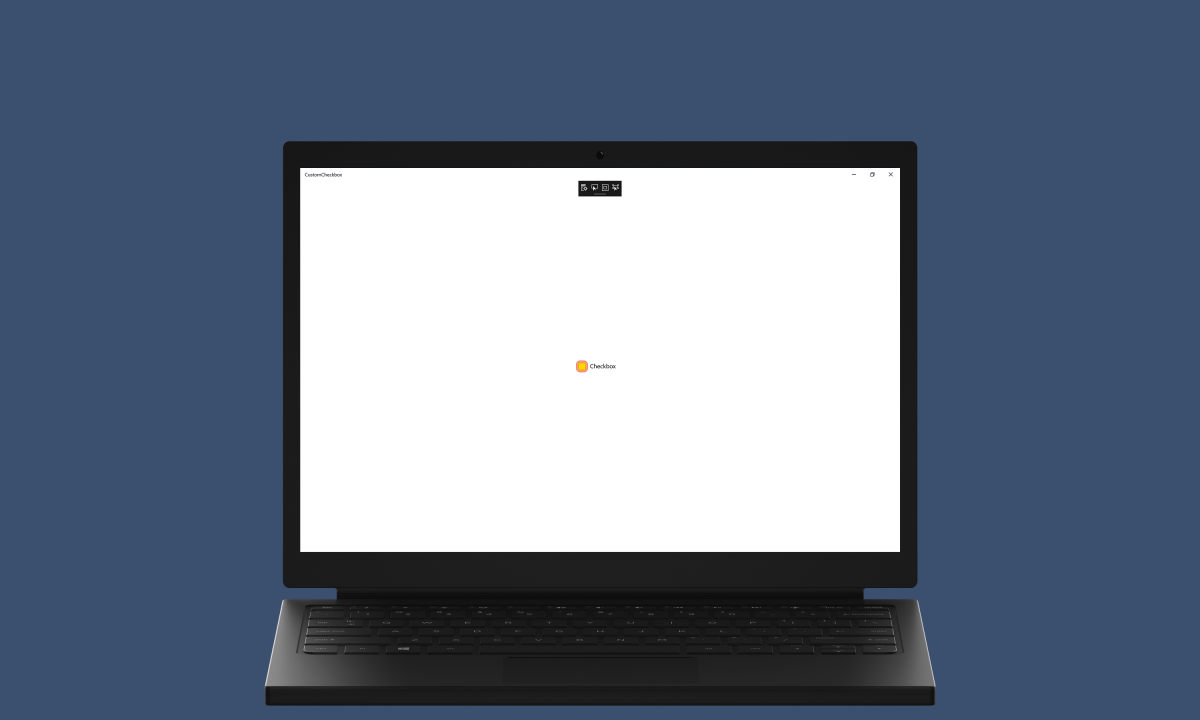 Custom Checkbox |
 Custom Toggle |
 Segment Control |
 Radial Control |
 Offset Control |
 Gauge Control |
 Font Control |
 Colour Control |
 Cortana Command |
 Tile Output |
 Toast Input |
 Spotify |
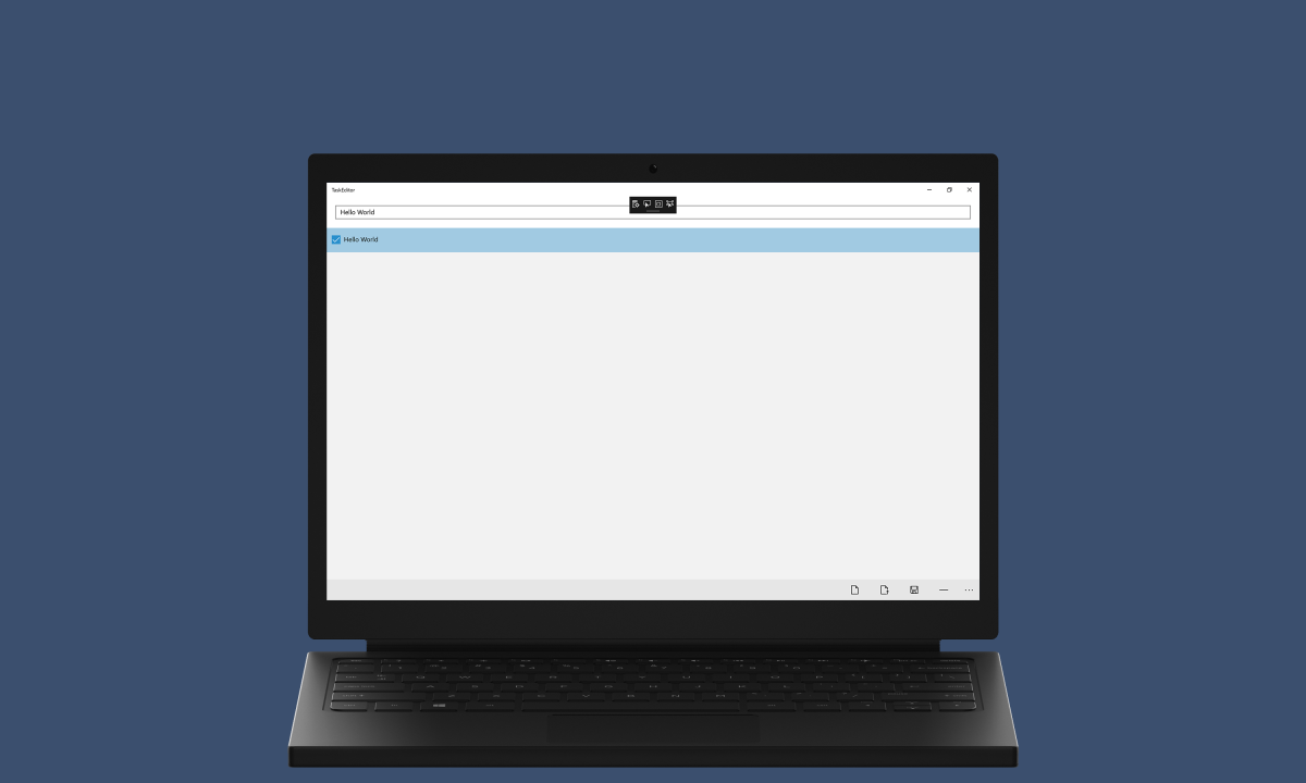
 Hello World |
Command Bar |
 Data Input |
 Image Rotate |
 Lucky Dice |
 Lucky Lotto |
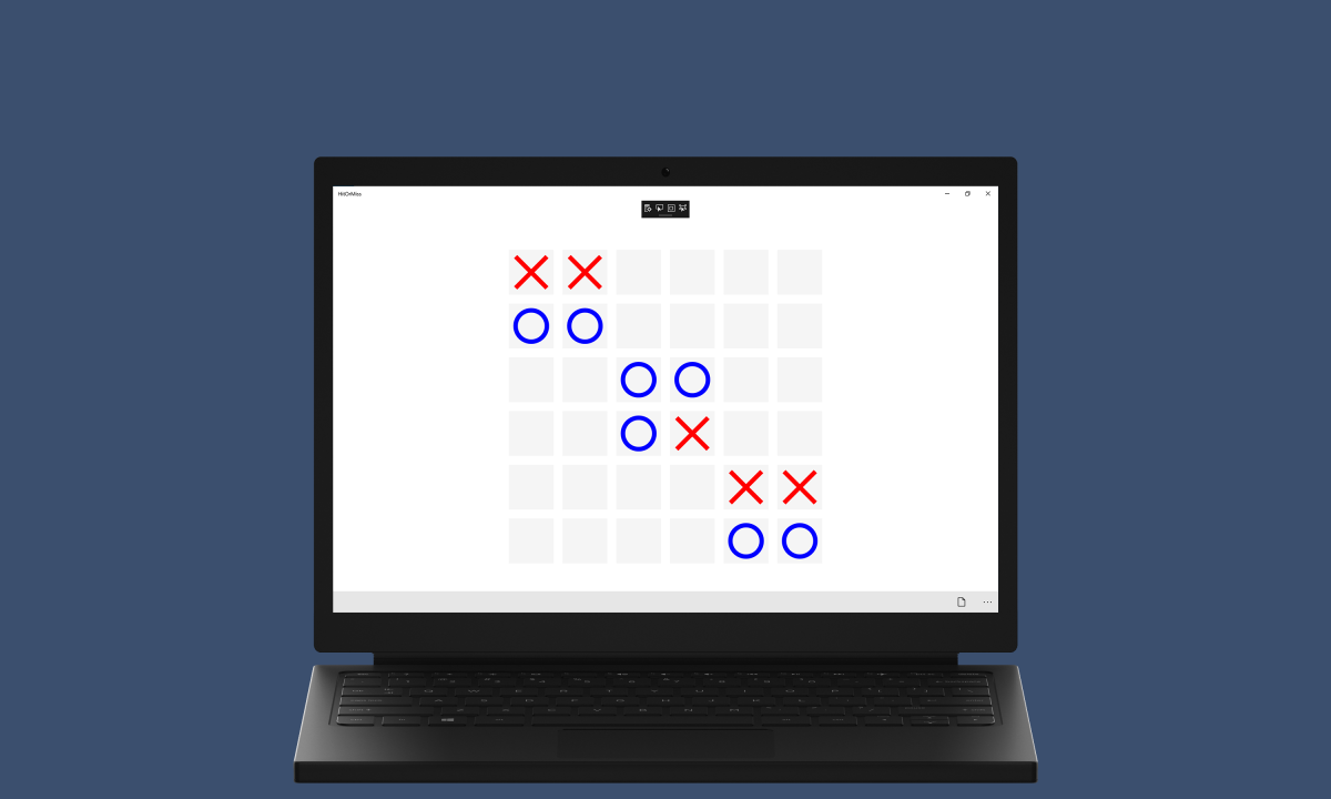
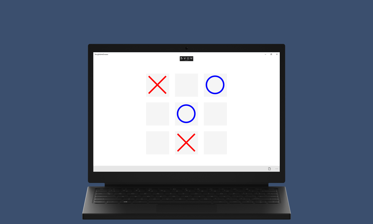 Noughts and Crosses |
 Memory Game |
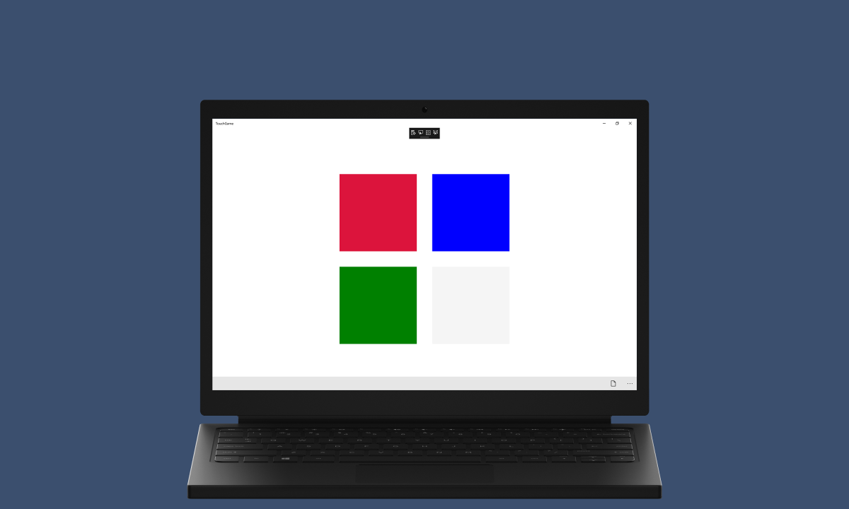 Touch Game |
 Playing Cards |
 Web Browser |
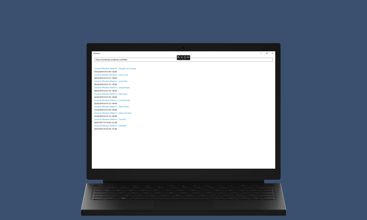 RSS Reader |
 Text Editor |
 Rich Editor |
 Task Editor |
 Draw Editor |
 Slide Player |
 Media Player |
 Audio Recorder |
 Video Recorder |
 Custom Button |
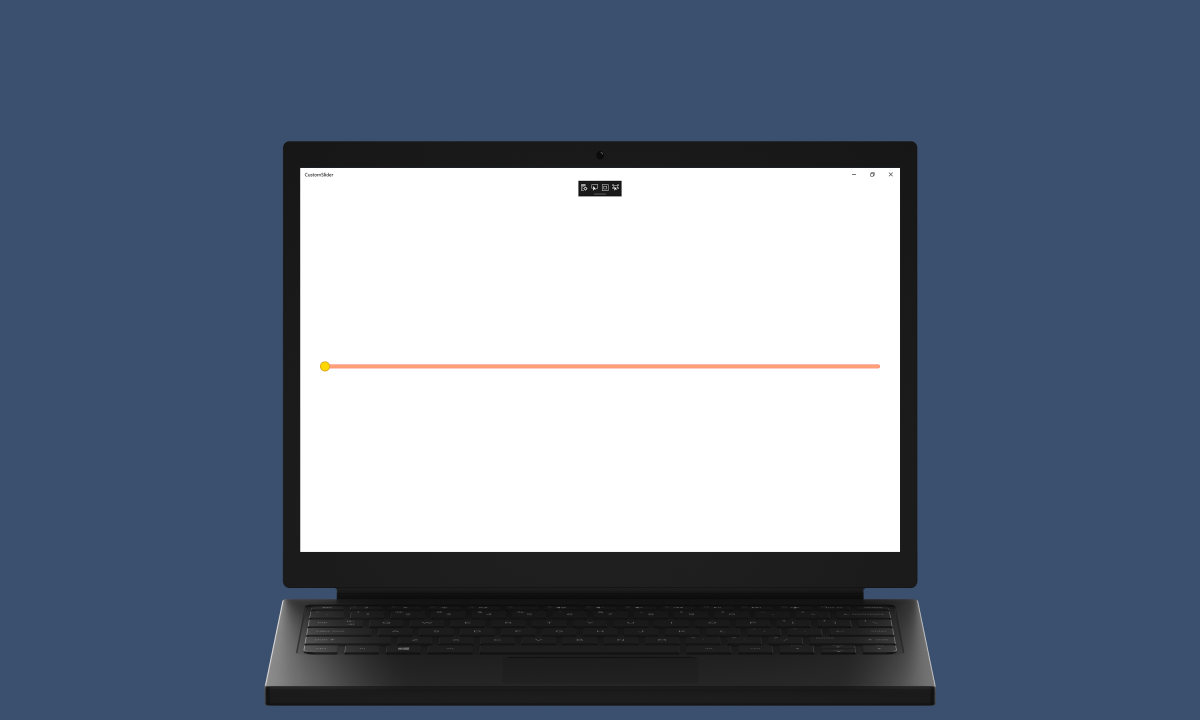 Custom Slider |
 Clock Control |
 Carousel Control |
 Wrap Control |
 Dial Control |
 Flip Control |
 Expand Control |
 Location |
 Tiles |
 Toasts |
 Agent |
 Source Code |

Adaptive Card demonstrates how to use Adaptive Cards, an open card exchange format, to add to the Timeline in Task View of Windows 10
If not already, follow Setup and Start on how to Install and get Started with Visual Studio 2017 or in Windows 10 choose Start, and then from the Start Menu find and select Visual Studio 2017.

Once Visual Studio Community 2017 has started, from the Menu choose File, then New then Project…

From New Project choose Visual C# from Installed, Templates then choose Blank App (Universal Windows) and then type in a Name and select a Location and then select Ok to create the Project

Then in New Universal Windows Project you need to select the Target Version this should be at least the Windows 10, version 1803 (10.0; Build 17134) which is the April 2018 Update and the Minimum Version to be the same.

The Target Version will control what features your application can use in Windows 10 so by picking the most recent version you’ll be able to take advantage of those features. To make sure you always have the most recent version, in Visual Studio 2017 select Tools Extensions and Updates… then and then see if there are any Updates
From the Menu choose Tools, then NuGet Package Manager and Package Manager Console

Then in the Package Manager Console Window which usually appears at the bottom of Visual Studio 2017 at the PM> Prompt type in following:
Install-Package AdaptiveCards

Followed by typing Enter to install AdaptiveCards from NuGet into the Application which should be Successfully installed
While still in the Package Manager Console Window of Visual Studio 2017 at the PM> Prompt type in following:
Install-Package AdaptiveCards.Rendering.Uwp

Followed by typing Enter to install AdaptiveCards.Rendering.Uwp from NuGet into the Application which should be Successfully installed
Once done select from the Menu, Project, then Add New Item…

From the Add New Item window select Visual C#, then Code from Installed then select Code File from the list, then type in the Name as Library.cs before selecting Add to add the file to the Project

Once in the Code View for Library.cs the following should be entered:
using AdaptiveCards;
using AdaptiveCards.Rendering.Uwp;
using System;
using System.Collections.Generic;
using System.Linq;
using System.Runtime.InteropServices.WindowsRuntime;
using System.Threading.Tasks;
using Windows.ApplicationModel.UserActivities;
using Windows.Graphics.Imaging;
using Windows.Storage;
using Windows.Storage.Pickers;
using Windows.Storage.Streams;
using Windows.UI.Shell;
using Windows.UI.Xaml;
using Windows.UI.Xaml.Controls;
using Windows.UI.Xaml.Media.Imaging;
using Cards = AdaptiveCards;
using RenderCards = AdaptiveCards.Rendering.Uwp;

public class AdaptiveItem
{
    public string Title { get; set; }
    public string Body { get; set; }
}

public class Card
{
    private const string auto = "Auto";
    private const string stretch = "Stretch";

    private readonly Random random = new Random((int)DateTime.Now.Ticks);
    private readonly AdaptiveCardRenderer renderer = new AdaptiveCardRenderer();
    private readonly Uri adaptive_card_image =
    new Uri("http://adaptivecards.io/content/adaptive-card-50.png");

    private Cards.AdaptiveCard GetCard(AdaptiveItem item)
    {
        Cards.AdaptiveCard card = new Cards.AdaptiveCard()
        {
            Id = random.Next(1, 100000000).ToString(),
            Body = new List<AdaptiveElement>()
            {
              new Cards.AdaptiveColumnSet()
              {
                    Columns = new List<Cards.AdaptiveColumn>()
                    {
                        new Cards.AdaptiveColumn()
                        {
                            Width = auto,
                            Items = new List<AdaptiveElement>()
                            {
                                new Cards.AdaptiveImage()
                                {
                                    Url = adaptive_card_image
                                }
                            }
                        },
                        new Cards.AdaptiveColumn()
                        {
                            Width = stretch,
                            Items = new List<AdaptiveElement>()
                            {
                                new Cards.AdaptiveTextBlock()
                                {
                                    Text = item.Title,
                                    Size = AdaptiveTextSize.ExtraLarge,
                                    Weight = AdaptiveTextWeight.Bolder,
                                },
                                new Cards.AdaptiveTextBlock()
                                {
                                    Text = item.Body,
                                    Size = AdaptiveTextSize.Medium,
                                    Weight = AdaptiveTextWeight.Lighter
                                }
                            },
                        }
                    }
                }
            }
        };
        return card;
    }

    private RenderCards.AdaptiveCard Convert(Cards.AdaptiveCard source, out string json)
    {
        try
        {
            json = source.ToJson();
            RenderCards.AdaptiveCardParseResult result = RenderCards.AdaptiveCard.FromJsonString(json);
            return result.AdaptiveCard;
        }
        catch (Exception)
        {
            json = null;
            return null;
        }
    }

    private Cards.AdaptiveCard Parse(string json)
    {
        try
        {
            Cards.AdaptiveCardParseResult result = Cards.AdaptiveCard.FromJson(json);
            return result.Card;
        }
        catch (Exception)
        {
            return null;
        }
    }

    private FrameworkElement Render(Cards.AdaptiveCard card, out string json)
    {
        try
        {
            RenderedAdaptiveCard rendered = renderer.RenderAdaptiveCard(Convert(card, out json));
            return rendered.FrameworkElement;
        }
        catch (Exception)
        {
            json = null;
            return null;
        }
    }

    public FrameworkElement Render(AdaptiveItem item, out string json)
    {
        Cards.AdaptiveCard card = GetCard(item);
        return Render(card, out json);
    }

    public FrameworkElement Render(string json)
    {
        Cards.AdaptiveCard card = Parse(json);
        return Render(card, out json);
    }
}

public class Timeline
{
    private const string uri = "https://comentsys.wordpress.com/uwp-adaptive-card";
    private readonly Random random = new Random((int)DateTime.Now.Ticks);
    private readonly UserActivityChannel channel = UserActivityChannel.GetDefault();

    public async void Create(string json, string text)
    {
        string id = random.Next(1, 100000000).ToString();
        UserActivity activity = await channel.GetOrCreateUserActivityAsync(id);
        activity.VisualElements.DisplayText = text;
        activity.VisualElements.Content =
        AdaptiveCardBuilder.CreateAdaptiveCardFromJson(json);
        activity.ActivationUri = new Uri(uri);
        activity.FallbackUri = new Uri(uri);
        await activity.SaveAsync();
        UserActivitySession session = activity.CreateSession();
        session?.Dispose();
    }
}

public class Library
{
    private const string app_title = "Adaptive Card";
    private const string extension_json = ".json";
    private const string extension_png = ".png";

    private static readonly Card card = new Card();
    private static readonly Timeline timeline = new Timeline();

    private async Task<string> OpenAsync()
    {
        try
        {
            FileOpenPicker picker = new FileOpenPicker()
            {
                SuggestedStartLocation = PickerLocationId.ComputerFolder
            };
            picker.FileTypeFilter.Add(extension_json);
            StorageFile open = await picker.PickSingleFileAsync();
            if (open != null)
            {
                return await FileIO.ReadTextAsync(open);
            }
        }
        finally
        {
        }
        return null;
    }

    private async void Render(FrameworkElement element, StorageFile file)
    {
        using (IRandomAccessStream stream = await file.OpenAsync(FileAccessMode.ReadWrite))
        {
            BitmapEncoder encoder = await BitmapEncoder.CreateAsync(
            BitmapEncoder.PngEncoderId, stream);
            RenderTargetBitmap target = new RenderTargetBitmap();
            await target.RenderAsync(element, 0, 0);
            IBuffer buffer = await target.GetPixelsAsync();
            encoder.SetPixelData(BitmapPixelFormat.Bgra8, BitmapAlphaMode.Premultiplied,
            (uint)target.PixelWidth, (uint)target.PixelHeight, 96.0, 96.0, buffer.ToArray());
            await encoder.FlushAsync();
            target = null;
            buffer = null;
            encoder = null;
        }
    }

    private async void SaveAsync(FrameworkElement element, string json)
    {
        try
        {
            FileSavePicker picker = new FileSavePicker()
            {
                SuggestedStartLocation = PickerLocationId.DocumentsLibrary,
                DefaultFileExtension = extension_json,
                SuggestedFileName = "Template"
            };
            picker.FileTypeChoices.Add("Json File", new List<string>() { extension_json });
            picker.FileTypeChoices.Add("Image File", new List<string>() { extension_png });
            StorageFile save = await picker.PickSaveFileAsync();
            if (save != null)
            {
                if (save.FileType == extension_json)
                {
                    await FileIO.WriteTextAsync(save, json);
                }
                else if (save.FileType == extension_png)
                {
                    Render(element, save);
                }
            }
        }
        finally
        {
        }
    }

    public void View(ref TextBox title, ref TextBox body, ref TextBox input, ref Canvas display)
    {
        if (!string.IsNullOrEmpty(title.Text) && !string.IsNullOrEmpty(body.Text))
        {
            display.Children.Clear();
            AdaptiveItem item = new AdaptiveItem() { Title = title.Text, Body = body.Text };
            FrameworkElement element = card.Render(item, out string json);
            if (element != null && json != null)
            {
                input.Text = json;
                display.Children.Add(element);
            }
        }
    }

    public void View(ref TextBox input, ref Canvas display)
    {
        if (!string.IsNullOrEmpty(input.Text))
        {
            string json = input.Text;
            display.Children.Clear();
            FrameworkElement element = card.Render(json);
            if (element != null && json != null)
            {
                input.Text = json;
                display.Children.Add(element);
            }
        }
    }

    public async void Open(TextBox input, Canvas display)
    {
        string json = await OpenAsync();
        if (json != null)
        {
            FrameworkElement element = card.Render(json);
            if (element != null && json != null)
            {
                input.Text = json;
                display.Children.Add(element);
            }
        }
    }

    public void Save(ref TextBox input, ref Canvas display)
    {
        if (!string.IsNullOrEmpty(input.Text) && display.Children.Any())
        {
            string json = input.Text;
            FrameworkElement element = display.Children.FirstOrDefault() as FrameworkElement;
            SaveAsync(element, json);
        }
    }

    public void Add(ref TextBox input, ref Canvas display)
    {
        if (!string.IsNullOrEmpty(input.Text) && display.Children.Any())
        {
            string json = input.Text;
            timeline.Create(json, app_title);
        }
    }
}
In the Code File for Library there are using statements to include the necessary functionality. There is also a AdaptiveItem Class with Properties for Title and Body.
There is a CardClass which has various const and readonly Values including Random to produce randomised numbers and for AdaptiveCardRenderer to help produce rendered versions of the AdaptiveCard. There is a GetCard Method which will return an AdaptiveCard from the AdaptiveCards Package with a given layout which includes a Uri to an Image and some AdaptiveTextBlock to produce output from the passed in AdaptiveItem. There is a Convert Method to convert from AdaptiveCard from the AdaptiveCards.Rendering.Uwp Package to one from the AdaptiveCards Package. Then there are Render Methods to produce the FrameworkElement and JSON string based on an AdaptiveCard from AdaptiveCards Package, an AdaptiveItem or from JSON.
There is a Timeline Class which has some const and readonly Members including for UserActivityChannel. The Create Method is used to generate a UserActivity from the passed in JSON string and uses the UserActivityChannel and UserActivitySession to add an item to the Timeline in Windows 10 with the content from CreateAdaptiveCardFromJson of AdaptiveCardBuilder.
The Library Class has various const and readonly Values including Card for the AdaptiveCard Functionality and Timeline for the UserActivity Functionality. OpenAsync is used with a FileOpenPicker and the ReadTextAsync of FileIO to read a Text File. SaveAsync is used with FileSavePicker and WriteTextAsync of FileIO.
Also in the Library Class is a SaveAsync Method which is which takes a FrameworkElement and StorageFile – with an IRandomAccessStream from this it will use a BitmapEncoder with RenderTargetBitmap to create the Image to be Rendered from the passed in FrameworkElement. SaveAsync is used with a FileSavePicker and the WriteTextAsync of FileIO for the .json File Extension or Json File and Render is used for the .png File Extension or Image File.
Finally in the Library Class there are View Method which will both get a FrameworkElement from the Render Method of the Card Class with one using the AdaptiveItem and the other just json. Then there is an Open Method which will use OpenAsync to get json and use this with the Render Method of the Card Class for json. The Save Method will use SaveAsync to output either content of a TextBox as json or the Children of a Canvas as FrameworkElement to then be optionally output as an Image. Thre Add Merhod is used to call the Create Method of the Timeline Class to insert an item into the Timeline of Windows 10 in Task View.
In the Solution Explorer select MainPage.xaml

From the Menu choose View and then Designer

The Design View will be displayed along with the XAML View and in this between the Grid and /Grid elements, enter the following XAML:
<Grid Margin="50">
	<Grid.RowDefinitions>
		<RowDefinition Height="Auto"/>
		<RowDefinition Height="*"/>
	</Grid.RowDefinitions>
	<Grid.ColumnDefinitions>
		<ColumnDefinition Width="50*"/>
		<ColumnDefinition Width="50*"/>
	</Grid.ColumnDefinitions>
	<TextBox Name="Title" Grid.Row="0" Grid.Column="0" PlaceholderText="Title" Margin="20"/>
	<TextBox Name="Body" Grid.Row="0" Grid.Column="1" PlaceholderText="Body" Margin="20"/>
	<TextBox Name="Input" Grid.Row="1" Grid.Column="0" AcceptsReturn="True" TextWrapping="Wrap" Margin="20"/>
	<Canvas Name="Display" Grid.Row="1" Grid.Column="1" Margin="20"/>
</Grid>
<CommandBar Name="Command" VerticalAlignment="Bottom">
	<AppBarButton Icon="View" Label="View">
		<AppBarButton.Flyout>
			<MenuFlyout>
				<MenuFlyoutItem Icon="PreviewLink" Text="Item" Click="Item_Click"/>
				<MenuFlyoutItem Icon="Document" Text="Json" Click="Json_Click"/>
			</MenuFlyout>
		</AppBarButton.Flyout>
	</AppBarButton>
	<AppBarButton Icon="OpenFile" Label="Open" Click="Open_Click"/>
	<AppBarButton Icon="Save" Label="Save" Click="Save_Click"/>
	<AppBarButton Icon="Add" Label="Add" Click="Add_Click"/>
</CommandBar>
Within the main Grid Element, the first block of XAML is a Grid Control which has two Rows and two Columns, in the first Row are two TextBox Controls in a Column each for Title and Body and in first Column of the second Row is a TextBox for Input of JSON and in the second Column of the second Row is a Canvas for Display. The second block of XAML is a CommandBar with AppBarButton for View which contains a MenuFlyout with MenuFlyoutItem for Item which calls Item_Click and Json which calls Json_Click. There are AppBarButton for Open which calls Open_Click, for Save which calls Save_Click and Add which calls Add_Click.
From the Menu choose View and then Code

Once in the Code View, below the end of public MainPage() { … } the following Code should be entered:
Library library = new Library();

private void Item_Click(object sender, RoutedEventArgs e)
{
	library.View(ref Title, ref Body, ref Input, ref Display);
}

private void Json_Click(object sender, RoutedEventArgs e)
{
	library.View(ref Input, ref Display);
}

private void Open_Click(object sender, RoutedEventArgs e)
{
	library.Open(Input, Display);
}

private void Save_Click(object sender, RoutedEventArgs e)
{
	library.Save(ref Input, ref Display);
}

private void Add_Click(object sender, RoutedEventArgs e)
{
	library.Add(ref Input, ref Display);
}
Below the MainPage() Method an instance of the Library Class is created, then there is an Item_Click Event Handler which calls the View Method in the Library Class and a Json_Click Event Handler which calls the other View Method of the Library Class. There is also Open_Click Event Handler which calls the Open Method of the Library Class and a Save_Click Event Handler which calls the Save Method of the Library Class, finally there is an Add_Click Event Handler which calls the Add Method in the Library Class.
That completes the Universal Windows Platform Application so Save the Project then in Visual Studio select the Local Machine to run the Application

After the Application has started running you can then type into the TextBox for Title and Body then select View to display the JSON and Display for the Adaptive Card or you can use Open to select a JSON Template to use instead, you can then use Add to add this to the Timeline of Task View in Windows 10

An Activity will be displayed using the Adaptive Card in Windows 10 in the Task View in the Timeline created in the Application.

To Exit the Application select the Close button in the top right of the Application
Adaptive Card shows how to use the Packages for AdaptiveCards and AdaptiveCards.Rendering.Uwp from NuGet to create an Adaptive Card, it can also preview the output and can take JSON as input and can then use other templates, to get these and to find out more information about Adaptive Cards go to http://adaptivecards.io which is also the source of the Image used in the Example which is the Logo created for them by Microsoft.


Adaptable Toast demonstrates how to use Adaptive Toast Notifications to display Toast Notifications in the Action Centre in Windows 10
If not already, follow Setup and Start on how to Install and get Started with Visual Studio 2017 or in Windows 10 choose Start, and then from the Start Menu find and select Visual Studio 2017.
Once Visual Studio Community 2017 has started, from the Menu choose File, then New then Project…
From New Project choose Visual C# from Installed, Templates then choose Blank App (Universal Windows) and then type in a Name and select a Location and then select Ok to create the Project
Then in New Universal Windows Project you need to select the Target Version this should be at least the Windows 10, version 1803 (10.0; Build 17134) which is the April 2018 Update and the Minimum Version to be the same.
The Target Version will control what features your application can use in Windows 10 so by picking the most recent version you’ll be able to take advantage of those features. To make sure you always have the most recent version, in Visual Studio 2017 select Tools Extensions and Updates… then and then see if there are any Updates
From the Menu choose Tools, then NuGet Package Manager and Package Manager Console
Then in the Package Manager Console Window which usually appears at the bottom of Visual Studio 2017 at the PM> Prompt type in following:
Install-Package Microsoft.Toolkit.Uwp.Notifications

Followed by typing Enter to install Microsoft.Toolkit.Uwp.Notifications from NuGet into the Application which should be Successfully installed
Once done select from the Menu, Project, then Add New Item…
From the Add New Item window select Visual C#, then Code from Installed then select Code File from the list, then type in the Name as Library.cs before selecting Add to add the file to the Project
Once in the Code View for Library.cs the following should be entered:
using Microsoft.Toolkit.Uwp.Notifications;
using System;
using System.Collections.Generic;
using System.Collections.Specialized;
using System.Linq;
using System.Threading.Tasks;
using System.Web;
using Windows.ApplicationModel.Activation;
using Windows.Foundation;
using Windows.UI.Notifications;
using Windows.UI.Popups;
using Windows.UI.Xaml.Controls;

public class AdaptableItem
{
    private const string key_id = "id";
    private const string key_title = "title";
    private const string key_body = "body";

    private string CreateQueryString(Dictionary<string, string> source)
    {
        string[] array = source.Select(kv =>
        $"{HttpUtility.UrlEncode(kv.Key)}={HttpUtility.UrlEncode(kv.Value)}").ToArray();
        return $"?{string.Join("&", array)}";
    }

    private Dictionary<string, string> ParseQueryString(string query)
    {
        NameValueCollection value = HttpUtility.ParseQueryString(query);
        return value.AllKeys.ToDictionary(x => HttpUtility.UrlDecode(x),
        x => HttpUtility.UrlDecode(value[x]));
    }

    public string Id { get; set; }
    public string Title { get; set; }
    public string Body { get; set; }

    public AdaptableItem() { }

    public AdaptableItem(string value)
    {
        Dictionary<string, string> dict = ParseQueryString(value);
        Id = dict[key_id];
        Title = dict[key_title];
        Body = dict[key_body];
    }

    public string Create()
    {
        Dictionary<string, string> dict = new Dictionary<string, string>()
        {
            { key_id, this.Id },
            { key_title, this.Title },
            { key_body, this.Body }
        };
        return CreateQueryString(dict);
    }

    public override string ToString()
    {
        return $"Id: {Id}, Title: {Title}, Body: {Body}";
    }
}

public class Toast
{
    private readonly Random random = new Random((int)DateTime.Now.Ticks);

    private ToastNotification GetNotification(AdaptableItem item)
    {
        ToastContent content = new ToastContent()
        {
            Launch = item.Create(),
            Visual = new ToastVisual()
            {
                BindingGeneric = new ToastBindingGeneric()
                {
                    AppLogoOverride = new ToastGenericAppLogo()
                    {
                        Source = "ms-appx:///Assets/StoreLogo.png"
                    },
                    Children =
                    {
                        new AdaptiveText()
                        {
                            Text = item.Title,
                            HintStyle = AdaptiveTextStyle.Body
                        },
                        new AdaptiveText()
                        {
                            Text = item.Body,
                            HintWrap = true,
                            HintStyle = AdaptiveTextStyle.CaptionSubtle
                        }
                    }
                }
            }
        };
        return new ToastNotification(content.GetXml());
    }

    public AdaptableItem Show(string title, string body)
    {
        string id = random.Next(1, 100000000).ToString();
        AdaptableItem item = new AdaptableItem() { Id = id, Title = title, Body = body };
        ToastNotification notification = GetNotification(item);
        ToastNotificationManager.CreateToastNotifier().Show(notification);
        return item;
    }
}

public static class Library
{
    private const string app_title = "Adaptable Toast";
    private static readonly Toast toast = new Toast();

    private static IAsyncOperation<IUICommand> _dialogCommand;

    private static async Task<bool> ShowDialogAsync(string content, string title = app_title)
    {
        try
        {
            if (_dialogCommand != null)
            {
                _dialogCommand.Cancel();
                _dialogCommand = null;
            }
            _dialogCommand = new MessageDialog(content, title).ShowAsync();
            await _dialogCommand;
            return true;
        }
        catch (TaskCanceledException)
        {
            return false;
        }
    }

    public static async void Activated(ToastNotificationActivatedEventArgs args)
    {
        if (args != null)
        {
            string argument = args.Argument;
            await ShowDialogAsync($"Selected - {new AdaptableItem(argument)}");
        }
    }

    public static void Add(TextBox title, TextBox desc)
    {
        toast.Show(title.Text, desc.Text);
    }
}
In the Code File for Library there are using statements to include the necessary functionality. There is also a AdaptableItem Class with const for Keys, a CreateQueryString to convert a Dictionary of string and string to a Query String, there is a ParseQueryString to convert a Query String back to a Dictionary of string and string. There are also Properties for Id, Colour, Title and Body. The CreateMethod will produce a Query String from a the AdaptableItem using a Dictionary of string and string and the ToString Method produces a string representation of the AdaptableItem Class Object.
The Toast Class has a Random to produce randomised numeric values, a GetNotification Method to create a ToastNotification which uses ToastContent from the Microsoft.Toolkit.Uwp.Notifications Package and there is an Show Method which will create a AdaptableItem with an Id using Random and then with the ToastNotificationManager call Show on the CreateToastNotifier to show the ToastNotification for the Application.
The Library Class has const and readonly Values including an Instance of the Toast Class and has an IAsyncOperation of IUICommand for use with the ShowDialogAsync Method which will display a MessageDialog. There is a Activated Method which will check the TileActivatedInfo from the passed in ToastNotificationActivatedEventArgs get the Argument and use ShowDialogAsync with a created AdaptableItem to display its details in a MessageDialog. Then there is an Add Method which will call the Show Method of the Toast Class which will display the ToastNotification.
In the Solution Explorer select App.xaml

From the Menu choose View and then Code
Once in the Code View below private void OnSuspending(object sender, SuspendingEventArgs e) { … } the following should be entered:
protected override void OnActivated(IActivatedEventArgs e)
{
	base.OnActivated(e);
	try
	{
		if (e.Kind == ActivationKind.ToastNotification)
		{
			Library.Activated(e as ToastNotificationActivatedEventArgs);
		}
	}
	catch { }
	Frame rootFrame = Window.Current.Content as Frame;
	if (rootFrame == null)
	{
		rootFrame = new Frame();
		rootFrame.NavigationFailed += OnNavigationFailed;
		Window.Current.Content = rootFrame;
	}
	if (rootFrame.Content == null)
	{
		rootFrame.Navigate(typeof(MainPage), e);
	}
	Window.Current.Activate();
}
The OnActivated Event Handler will be triggered when the Toast Notification Launches the application which is ActivationKind.ToastNotification and then the ToastNotificationActivatedEventArgs Implementation of IActivatedEventArgs will be obtained and passed to the the Activated Method of the Library Class will be called, because the static Keyword is used it is not necessary to use new to create an Instance of the Library Class before calling this Method.
In the Solution Explorer select MainPage.xaml
From the Menu choose View and then Designer
The Design View will be displayed along with the XAML View and in this between the Grid and /Grid elements, enter the following XAML:
<Grid Margin="50">
	<Grid.ColumnDefinitions>
		<ColumnDefinition Width="50*"/>
		<ColumnDefinition Width="50*"/>
	</Grid.ColumnDefinitions>
	<TextBox Name="Title" Grid.Column="0" PlaceholderText="Title" Margin="20" VerticalAlignment="Top"/>
	<TextBox Name="Body" Grid.Column="1" PlaceholderText="Body" Margin="20" VerticalAlignment="Top"/>
</Grid>
<CommandBar Name="Command" VerticalAlignment="Bottom">
	<AppBarButton Icon="Add" Label="Add" Click="Add_Click"/>
</CommandBar>
Within the main Grid Element, the first block of XAML is a Grid Control which has two Columns which are TextBox Controls in a Column each for Title and Body. The second block of XAML is a CommandBar with an AppBarButton for Add which calls Add_Click.
From the Menu choose View and then Code
Once in the Code View, below the end of public MainPage() { … } the following Code should be entered:
private void Add_Click(object sender, RoutedEventArgs e)
{
	Library.Add(Title, Body);
}
Below the MainPage() there is an Add_Click Event Handler which calls the Add Method in the Library Class and again because the static Keyword is used it is not necessary to use new to create an Instance of the Library Class before calling this Method.
That completes the Universal Windows Platform Application so Save the Project then in Visual Studio select the Local Machine to run the Application
After the Application has started running you can then type into the TextBox for Title and Body then select Add to display the Toast Notification

To Exit the Application select the Close button in the top right of the Application
Adaptable Toast shows how to create an Adaptive Toast with the NuGet Package for Microsoft.Toolkit.Uwp.Notifications to create a ToastNotification and then respond to this in an Application when Launched from the ToastNotification.

Chaseable Tiles demonstrates how to use Chaseable Tile Notifications on an application’s pinned Live Tile in Windows 10
If not already, follow Setup and Start on how to Install and get Started with Visual Studio 2017 or in Windows 10 choose Start, and then from the Start Menu find and select Visual Studio 2017.
Once Visual Studio Community 2017 has started, from the Menu choose File, then New then Project…
From New Project choose Visual C# from Installed, Templates then choose Blank App (Universal Windows) and then type in a Name and select a Location and then select Ok to create the Project
Then in New Universal Windows Project you need to select the Target Version this should be at least the Windows 10, version 1803 (10.0; Build 17134) which is the April 2018 Update and the Minimum Version to be the same.
The Target Version will control what features your application can use in Windows 10 so by picking the most recent version you’ll be able to take advantage of those features. To make sure you always have the most recent version, in Visual Studio 2017 select Tools Extensions and Updates… then and then see if there are any Updates
From the Menu choose Tools, then NuGet Package Manager and Package Manager Console
Then in the Package Manager Console Window which usually appears at the bottom of Visual Studio 2017 at the PM> Prompt type in following:
Install-Package Microsoft.Toolkit.Uwp.Notifications

Followed by typing Enter to install Microsoft.Toolkit.Uwp.Notifications from NuGet into the Application which should be Successfully installed
Once done select from the Menu, Project, then Add New Item…
From the Add New Item window select Visual C#, then Code from Installed then select Code File from the list, then type in the Name as Library.cs before selecting Add to add the file to the Project
Once in the Code View for Library.cs the following should be entered:
using Microsoft.Toolkit.Uwp.Notifications;
using System;
using System.Collections.Generic;
using System.Collections.Specialized;
using System.Linq;
using System.Threading.Tasks;
using System.Web;
using Windows.ApplicationModel;
using Windows.ApplicationModel.Activation;
using Windows.ApplicationModel.Core;
using Windows.Foundation;
using Windows.UI.Notifications;
using Windows.UI.Popups;
using Windows.UI.StartScreen;
using Windows.UI.Xaml.Controls;

public class ChaseableItem
{
    private const string key_id = "id";
    private const string key_title = "title";
    private const string key_body = "body";

    private string CreateQueryString(Dictionary<string, string> source)
    {
        string[] array = source.Select(kv =>
        $"{HttpUtility.UrlEncode(kv.Key)}={HttpUtility.UrlEncode(kv.Value)}").ToArray();
        return $"?{string.Join("&", array)}";
    }

    private Dictionary<string, string> ParseQueryString(string query)
    {
        NameValueCollection value = HttpUtility.ParseQueryString(query);
        return value.AllKeys.ToDictionary(x => HttpUtility.UrlDecode(x),
        x => HttpUtility.UrlDecode(value[x]));
    }

    public string Id { get; set; }
    public string Title { get; set; }
    public string Body { get; set; }

    public ChaseableItem() { }

    public ChaseableItem(string value)
    {
        Dictionary<string, string> dict = ParseQueryString(value);
        Id = dict[key_id];
        Title = dict[key_title];
        Body = dict[key_body];
    }

    public string Create()
    {
        Dictionary<string, string> dict = new Dictionary<string, string>()
        {
            { key_id, this.Id },
            { key_title, this.Title },
            { key_body, this.Body }
        };
        return CreateQueryString(dict);
    }

    public override string ToString()
    {
        return $"Id: {Id}, Title: {Title}, Body: {Body}";
    }
}

public class Tile
{
    private readonly Random random = new Random((int)DateTime.Now.Ticks);

    private TileNotification GetNotification(ChaseableItem item)
    {
        TileContent content = new TileContent()
        {
            Visual = new TileVisual()
            {
                Arguments = item.Create(),
                Branding = TileBranding.NameAndLogo,
                TileMedium = new TileBinding()
                {
                    Content = new TileBindingContentAdaptive()
                    {
                        Children =
                        {
                            new AdaptiveText()
                            {
                                Text = item.Title,
                                HintStyle = AdaptiveTextStyle.Body
                            },
                            new AdaptiveText()
                            {
                                Text = item.Body,
                                HintWrap = true,
                                HintStyle = AdaptiveTextStyle.CaptionSubtle
                            }
                        }
                    }
                }
            }
        };
        return new TileNotification(content.GetXml());
    }

    public ChaseableItem Update(string title, string body)
    {
        string id = random.Next(1, 100000000).ToString();
        ChaseableItem item = new ChaseableItem() { Id = id, Title = title, Body = body };
        TileNotification notification = GetNotification(item);
        TileUpdateManager.CreateTileUpdaterForApplication().Update(notification);
        return item;
    }
}

public static class Library
{
    private const string app_title = "Chaseable Tiles";
    private static readonly Tile tile = new Tile();

    private static IAsyncOperation<IUICommand> _dialogCommand;

    private static async Task<bool> ShowDialogAsync(string content, string title = app_title)
    {
        try
        {
            if (_dialogCommand != null)
            {
                _dialogCommand.Cancel();
                _dialogCommand = null;
            }
            _dialogCommand = new MessageDialog(content, title).ShowAsync();
            await _dialogCommand;
            return true;
        }
        catch (TaskCanceledException)
        {
            return false;
        }
    }

    public static async void Launched(LaunchActivatedEventArgs args)
    {
        if(args.TileActivatedInfo != null)
        {
            string argument = args.TileActivatedInfo.RecentlyShownNotifications
            .Select(s => s.Arguments).FirstOrDefault();
            await ShowDialogAsync($"Selected - {new ChaseableItem(argument)}");
        }
    }

    public static async void Add(TextBox title, TextBox desc)
    {
        await ShowDialogAsync($"Added - {tile.Update(title.Text, desc.Text)}");
    }

    public static async Task<bool> PinAsync()
    {
        bool isPinned = false;
        AppListEntry entry = (await Package.Current.GetAppListEntriesAsync()).FirstOrDefault();
        if (entry != null)
        {
            isPinned = await StartScreenManager.GetDefault().ContainsAppListEntryAsync(entry);
        }
        if (!isPinned)
        {
            isPinned = await StartScreenManager.GetDefault().RequestAddAppListEntryAsync(entry);
        }
        return isPinned;
    }
}
In the Code File for Library there are using statements to include the necessary functionality. There is also a ChaseableItem Class with const for Keys, a CreateQueryString to convert a Dictionary of string and string to a Query String, there is a ParseQueryString to convert a Query String back to a Dictionary of string and string. There are also Properties for Id, Colour, Title and Body. The CreateMethod will produce a Query String from a the ChaseableItem using a Dictionary of string and string and the ToString Method produces a string representation of the ChaseableItem Class Object.
The Tile Class has a Random to produce randomised numeric values, a GetNotification Method to create a TileNotification which uses TileContent from the Microsoft.Toolkit.Uwp.Notifications Package and there is an Update Method which will create a ChaseableItem with an Id using Random and then with the TileUpdateManager call Update on the CreateTileUpdaterForApplication to add the TileNotification to the Live Tile for the Application.
The Library Class has const and readonly Values including an Instance of the Tile Class and has an IAsyncOperation of IUICommand for use with the ShowDialogAsync Method which will display a MessageDialog. There is a Launched Method which will check the TileActivatedInfo from the passed in LaunchActivatedEventArgs get the FirstOrDefault from the RecentlyShownNotifications and use ShowDialogAsync with a created ChaseableItem to display its details in a MessageDialog.
Also in the Library Class is an Add Method which will call the Update Method of the Tile Class and then display its details in a MessageDialog with ShowDialogAsync. Finally there is a PinAsync Method which determines if the application is pinned to start with the GetAppListEntriesAsync from the Package.Current with ContainsAppListEntryAsync from the StartScreenManager.GetDefault method and if not uses the RequestAddAppListEntryAsync to Pin the application to Start in Windows 10.
In the Solution Explorer select App.xaml
From the Menu choose View and then Code
Once in the Code View in protected override void OnLaunched(LaunchActivatedEventArgs e) { … } below Frame rootFrame = Window.Current.Content as Frame; the following should be entered:
Library.Launched(e);
In OnLaunched Event Handler the Launched Method of the Library Class will be called, because the static Keyword is used it is not necessary to use new to create an Instance of the Library Class before calling this Method.
In the Solution Explorer select MainPage.xaml
From the Menu choose View and then Designer
The Design View will be displayed along with the XAML View and in this between the Grid and /Grid elements, enter the following XAML:
<Grid Margin="50">
	<Grid.ColumnDefinitions>
		<ColumnDefinition Width="50*"/>
		<ColumnDefinition Width="50*"/>
	</Grid.ColumnDefinitions>
	<TextBox Name="Title" Grid.Column="0" PlaceholderText="Title" Margin="20" VerticalAlignment="Top"/>
	<TextBox Name="Body" Grid.Column="1" PlaceholderText="Body" Margin="20" VerticalAlignment="Top"/>
</Grid>
<CommandBar Name="Command" VerticalAlignment="Bottom">
	<AppBarButton Icon="Pin" Label="Pin" Click="Pin_Click"/>
	<AppBarButton Icon="Add" Label="Add" Click="Add_Click"/>
</CommandBar>
Within the main Grid Element, the first block of XAML is a Grid Control which has two Columns which are TextBox Controls in a Column each for Title and Body. The second block of XAML is a CommandBar with AppBarButton for Pin which calls Pin_Click and for Add which calls Add_Click and again because the static Keyword is used it is not necessary to use new to create an Instance of the Library Class before calling this Method.
From the Menu choose View and then Code
Once in the Code View, below the end of public MainPage() { … } the following Code should be entered:
private async void Pin_Click(object sender, RoutedEventArgs e)
{
	await Library.PinAsync();
}

private void Add_Click(object sender, RoutedEventArgs e)
{
	Library.Add(Title, Body);
}
Below the MainPage() there is a Pin_Click Event Handler which calls the PinAsync Method in the Library Class and Add_Click Event Handler which calls the Add Method in the Library Class and again because the static Keyword is used it is not necessary to use new to create an Instance of the Library Class before calling this Method.
That completes the Universal Windows Platform Application so Save the Project then in Visual Studio select the Local Machine to run the Application
After the Application has started running you can then select Pin to pin-to-start the Application and then you can then type into the TextBox for Title and Body then select Add to update the Live Tile for the Application in Start of Windows 10

The Live Tile will be displayed in Windows 10 on the Start Menu for the Application with the Title and Body Entered, you can create multiple Notifications and when selected the correct content will be displayed back in the Application.

To Exit the Application select the Close button in the top right of the Application
Chaseable Tiles shows how easy it is to add many different TileNotification items to the Live Tile of an Application and when selected response to the particular Notification that was displayed within your Application which could be anything from displaying a News Story or anything else where you’ve updated a Live Tile and want your Application to have that information presented when the Live Tile is interacted with when a particular TileNotification is being displayed.

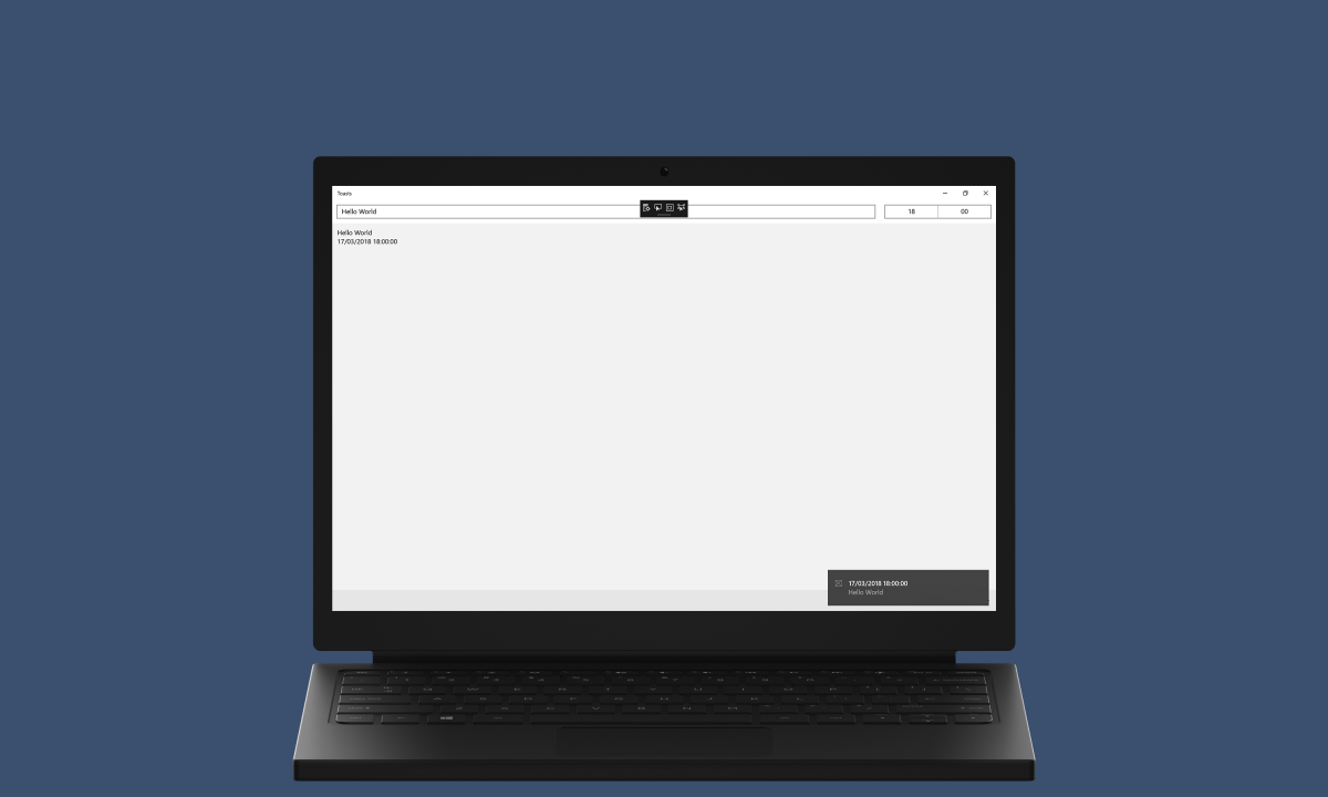
Timeline demonstrates how to use UserActivity to add to the Timeline in Task View of Windows 10
If not already, follow Setup and Start on how to Install and get Started with Visual Studio 2017 or in Windows 10 choose Start, and then from the Start Menu find and select Visual Studio 2017.
Once Visual Studio Community 2017 has started, from the Menu choose File, then New then Project…
From New Project choose Visual C# from Installed, Templates then choose Blank App (Universal Windows) and then type in a Name and select a Location and then select Ok to create the Project
Then in New Universal Windows Project you need to select the Target Version this should be at least the Windows 10, version 1803 (10.0; Build 17134) which is the April 2018 Update and the Minimum Version to be the same.
The Target Version will control what features your application can use in Windows 10 so by picking the most recent version you’ll be able to take advantage of those features. To make sure you always have the most recent version, in Visual Studio 2017 select Tools Extensions and Updates… then and then see if there are any Updates
Once done select from the Menu, Project, then Add New Item…
From the Add New Item window select Visual C#, then Code from Installed then select Code File from the list, then type in the Name as Library.cs before selecting Add to add the file to the Project
Once in the Code View for Library.cs the following should be entered:
using System;
using System.Collections.Generic;
using System.Collections.ObjectModel;
using System.Threading.Tasks;
using Windows.ApplicationModel.UserActivities;
using Windows.Foundation;
using Windows.UI;
using Windows.UI.Xaml.Controls;

public class TimelineItem
{
    public string Id { get; set; }
    public Color Colour { get; set; }
    public string Title { get; set; }
    public string Body { get; set; }
}

public class Library
{
    private const string app_title = "Timeline";
    private const string primary_text = "Create";
    private const string secondary_text = "Cancel";
    private const string timeline_uri = "https://comentsys.wordpress.com/uwp-timeline";
    private readonly Random random = new Random((int)DateTime.Now.Ticks);

    private ColorPicker _picker;
    private IAsyncOperation<ContentDialogResult> _dialogResult;
    private UserActivityChannel _channel = UserActivityChannel.GetDefault();
    private ObservableCollection<TimelineItem> _list = new ObservableCollection<TimelineItem>();

    private async Task<ContentDialogResult> ShowDialogAsync(object content, string title = app_title)
    {
        try
        {
            if (_dialogResult != null)
            {
                _dialogResult.Cancel();
                _dialogResult = null;
            }
            _dialogResult = new ContentDialog()
            {
                Title = app_title,
                Content = content,
                PrimaryButtonText = primary_text,
                SecondaryButtonText = secondary_text
            }.ShowAsync();
            return await _dialogResult;
        }
        catch (TaskCanceledException)
        {
            return ContentDialogResult.None;
        }
    }

    private async Task<Color?> ShowColour()
    {
        _picker = new ColorPicker()
        {
            IsColorChannelTextInputVisible = true,
            IsAlphaSliderVisible = false,
            IsColorSliderVisible = false,
            IsHexInputVisible = true,
            IsAlphaEnabled = false,
        };
        if (await ShowDialogAsync(_picker) == ContentDialogResult.Primary)
        {
            return _picker.Color;
        }
        return null;
    }

    private async Task<string> Create(string title, string body, Color background)
    {
        string id = random.Next(1, 100000000).ToString();
        UserActivity activity = await _channel.GetOrCreateUserActivityAsync(id);
        activity.VisualElements.DisplayText = title;
        activity.ActivationUri = new Uri(timeline_uri);
        activity.FallbackUri = new Uri(timeline_uri);
        activity.VisualElements.BackgroundColor = background;
        activity.VisualElements.Description = body;
        await activity.SaveAsync();
        UserActivitySession session = activity.CreateSession();
        session?.Dispose();
        return id;
    }

    public async void Init(ListBox display)
    {
        _list.Clear();
        IList<UserActivitySessionHistoryItem> list = await
            _channel.GetRecentUserActivitiesAsync(maxUniqueActivities: 25);
        foreach (UserActivitySessionHistoryItem item in list)
        {
            _list.Add(new TimelineItem()
            {
                Id = item.UserActivity.ActivityId,
                Title = item.UserActivity.VisualElements.DisplayText,
                Body = item.UserActivity.VisualElements.Description,
                Colour = item.UserActivity.VisualElements.BackgroundColor
            });
        }
        display.ItemsSource = _list;
    }

    public async void Add(ListBox display, TextBox title, TextBox body)
    {
        Color? result = await ShowColour();
        if (result != null)
        {
            string id = await Create(title.Text, body.Text, result.Value);
            _list.Add(new TimelineItem
            {
                Id = id,
                Title = title.Text,
                Body = body.Text,
                Colour = result.Value
            });
        }
    }

    public async void Remove(ListBox display, AppBarButton button)
    {
        TimelineItem item = (TimelineItem)button.Tag;
        if (_channel.GetOrCreateUserActivityAsync(item.Id) != null)
        {
            await _channel.DeleteActivityAsync(item.Id);
        }
        _list.Remove(item);
    }
}
In the Code File for Library there are using statements to include the necessary functionality. There is also a TimelineItem Class with Properties for Id, Colour, Title and Body.
The Library Class has various const and readonly Values including Random to produce randomised numbers. There are Members for ColourPicker and ContentDialogResult used with a ContentDialog later and UserActivityChannel for ttems added to the Timeline and an ObservableCollection for all the items added as TimelineItem.
Also in the Library Class is a ShowDialogAsync to show a ContentDialog which is used by ShowColour to display this with the Content set to a ColorPicker and return the resulting Color or null if Cancelled and there is a Create Method which will setup a UserActivity using some of the passed in values.
Finally in the Library Class there is an Init Method which will get any existing UserActivitySessionHistoryItem from the UserActivityChannel and populate the ObservableCollection of TimelineItem from this and set it to the ItemsSource of a ListBox. The Add Method will call ShowColour to pick a Colour then if this is set it will call the Create Method and insert a TimelineItem into the ObservableCollection of TimelineItem and the Remove Method will get a selected item from a Listbox then call DeleteActivityAsync on the UserActivityChannel, first checking with GetOrCreateUserActivityAsync to see if it exists then also Remove the item from the ObservableCollection.
In the Solution Explorer select MainPage.xaml
From the Menu choose View and then Designer
The Design View will be displayed along with the XAML View and in this between the Grid and /Grid elements, enter the following XAML:
<Grid Margin="50">
	<Grid.RowDefinitions>
		<RowDefinition Height="Auto"/>
		<RowDefinition Height="*"/>
	</Grid.RowDefinitions>
	<Grid Grid.Row="0">
		<Grid.ColumnDefinitions>
			<ColumnDefinition Width="50*"/>
			<ColumnDefinition Width="50*"/>
		</Grid.ColumnDefinitions>
		<TextBox Name="Title" Grid.Column="0" PlaceholderText="Title" Margin="20" VerticalAlignment="Center"/>
		<TextBox Name="Body" Grid.Column="1" PlaceholderText="Body" Margin="20" VerticalAlignment="Center"/>
	</Grid>
	<ListBox Name="Display" Grid.Row="1">
		<ListBox.ItemContainerStyle>
			<Style TargetType="ListBoxItem">
				<Setter Property="HorizontalContentAlignment" Value="Stretch" />
			</Style>
		</ListBox.ItemContainerStyle>
		<ListBox.ItemTemplate>
			<DataTemplate>
				<Grid>
					<Grid.ColumnDefinitions>
						<ColumnDefinition Width="Auto"/>
						<ColumnDefinition Width="50*"/>
						<ColumnDefinition Width="50*"/>
						<ColumnDefinition Width="Auto"/>
					</Grid.ColumnDefinitions>
					<Rectangle Grid.Column="0" Width="50" Height="30" Margin="5" VerticalAlignment="Center">
						<Rectangle.Fill>
							<SolidColorBrush Color="{Binding Path=Colour}"/>
						</Rectangle.Fill>
					</Rectangle>
					<TextBlock Grid.Column="1" TextWrapping="Wrap" Text="{Binding Path=Title}" VerticalAlignment="Center"/>
					<TextBlock Grid.Column="2" TextWrapping="Wrap" Text="{Binding Path=Body}" VerticalAlignment="Center"/>
					<AppBarButton Grid.Column="3" Tag="{Binding}" Icon="Remove" Label="Remove" Click="Remove_Click"/>
				</Grid>
			</DataTemplate>
		</ListBox.ItemTemplate>
	</ListBox>
</Grid>
<CommandBar Name="Command" VerticalAlignment="Bottom">
	<AppBarButton Icon="Add" Label="Add" Click="Add_Click"/>
</CommandBar>
Within the main Grid Element, the first block of XAML is a Grid Control which has two Rows and Columns, in the first Row are two TextBox Controls in a Column each for Title and Body and in the second Row is a ListBox this has a DataTemplate set which is a Grid with four Columns, the first for a Rectangle to show Colour, the second for a TextBlock for Title, the first for a TextBlock for Body and the fourth for a AppBarButton that calls Remove_Click. The second block of XAML is a CommandBar with AppBarButton for Add which calls Add_Click.
From the Menu choose View and then Code
Once in the Code View, below the end of public MainPage() { … } the following Code should be entered:
Library library = new Library();

protected override void OnNavigatedTo(NavigationEventArgs e)
{
	library.Init(Display);
}

private void Add_Click(object sender, RoutedEventArgs e)
{
	library.Add(Display, Title, Body);
}

private void Remove_Click(object sender, RoutedEventArgs e)
{
	library.Remove(Display, (AppBarButton)sender);
}
Below the MainPage() Method an instance of the Library Class is created, then there is an OnNavigatedTo Event Handler which calls the Init Method in the Library Class, there is an Add_Click Event Handler which calls the Add Method in the Library Class and Remove_Click which calls the Remove Method in the Library Class.
That completes the Universal Windows Platform Application so Save the Project then in Visual Studio select the Local Machine to run the Application
After the Application has started running you can then type into the TextBox for Title and Body then select Add to pick a Colour and to add this to the Timeline in Windows 10

The Activity will be displayed in Windows 10 in the Task View in the Timeline created in the Application.

To Exit the Application select the Close button in the top right of the Application
Timeline shows how easy it is to add to the Timeline and perform different activities either simple to launch a Url or more complex such as passing into an application or other options are possible with UserActivity and its related Classes and functionality.

Split Control demonstrates how to create an on-screen Split or Split-Flap Control to display the current Time and Date.
If not already, follow Setup and Start on how to Install and get Started with Visual Studio 2017 or in Windows 10 choose Start, and then from the Start Menu find and select Visual Studio 2017.
Once Visual Studio Community 2017 has started, from the Menu choose File, then New then Project…
From New Project choose Visual C# from Installed, Templates then choose Blank App (Universal Windows) and then type in the Name as SplitControl and select a Location and then select Ok to create the Project

Then in New Universal Windows Project you need to select the Target Version this should be at least the Windows 10, version 1803 (10.0; Build 17134) which is the April 2018 Update and the Minimum Version to be the same.
The Target Version will control what features your application can use in Windows 10 so by picking the most recent version you’ll be able to take advantage of those features. To make sure you always have the most recent version, in Visual Studio 2017 select Tools Extensions and Updates… then and then see if there are any Updates
Once done select from the Menu, Project, then Add New Item…
From the Add New Item window select Visual C#, then XAML from Installed then select User Control from the list, then type in the Name as Split.xaml before selecting Add to add the file to the Project

The Design View will be displayed along with the XAML View and in this above the Grid element, enter the following XAML:
<UserControl.Resources>
	<Style x:Key="SplitLabel" TargetType="TextBlock">
		<Setter Property="FontFamily" Value="Arial"/>
		<Setter Property="Foreground" Value="White"/>
		<Setter Property="FontSize" Value="75"/>
	</Style>
	<Style x:Key="GridStyle" TargetType="Grid">
		<Setter Property="CornerRadius" Value="4"/>
		<Setter Property="Background" Value="White"/>
		<Setter Property="BorderBrush" Value="Gray"/>
		<Setter Property="BorderThickness" Value="1,1,1,1"/>
	</Style>
	<LinearGradientBrush x:Key="BackgroundBrush" EndPoint="0.5,1" StartPoint="0.5,0">
		<GradientStop Color="#FF202020" Offset="1"/>
		<GradientStop Color="#FF404040"/>
	</LinearGradientBrush>
	<Storyboard x:Name="FlipAnimation">
		<DoubleAnimationUsingKeyFrames Storyboard.TargetName="BlockFlip"
		Storyboard.TargetProperty="(UIElement.RenderTransform).(TransformGroup.Children)[0].(ScaleTransform.ScaleY)">
			<EasingDoubleKeyFrame Value="1" KeyTime="0">
				<EasingDoubleKeyFrame.EasingFunction>
					<BounceEase EasingMode="EaseOut" Bounces="1" Bounciness="6"/>
				</EasingDoubleKeyFrame.EasingFunction>
			</EasingDoubleKeyFrame>
			<EasingDoubleKeyFrame Value="-1" KeyTime="00:00:00.250">
				<EasingDoubleKeyFrame.EasingFunction>
					<BounceEase EasingMode="EaseOut" Bounces="1" Bounciness="6"/>
				</EasingDoubleKeyFrame.EasingFunction>
			</EasingDoubleKeyFrame>
		</DoubleAnimationUsingKeyFrames>
		<ObjectAnimationUsingKeyFrames Storyboard.TargetName="TextBlockFlipTop"
		Storyboard.TargetProperty="(UIElement.Visibility)">
			<DiscreteObjectKeyFrame KeyTime="0">
				<DiscreteObjectKeyFrame.Value>
					<Visibility>Visible</Visibility>
				</DiscreteObjectKeyFrame.Value>
			</DiscreteObjectKeyFrame>
			<DiscreteObjectKeyFrame KeyTime="00:00:00.125">
				<DiscreteObjectKeyFrame.Value>
					<Visibility>Collapsed</Visibility>
				</DiscreteObjectKeyFrame.Value>
			</DiscreteObjectKeyFrame>
		</ObjectAnimationUsingKeyFrames>
		<ObjectAnimationUsingKeyFrames Storyboard.TargetName="TextBlockFlipBottom"
		Storyboard.TargetProperty="(UIElement.Visibility)">
			<DiscreteObjectKeyFrame KeyTime="0">
				<DiscreteObjectKeyFrame.Value>
					<Visibility>Collapsed</Visibility>
				</DiscreteObjectKeyFrame.Value>
			</DiscreteObjectKeyFrame>
			<DiscreteObjectKeyFrame KeyTime="00:00:00.125">
				<DiscreteObjectKeyFrame.Value>
					<Visibility>Visible</Visibility>
				</DiscreteObjectKeyFrame.Value>
			</DiscreteObjectKeyFrame>
		</ObjectAnimationUsingKeyFrames>
	</Storyboard>
</UserControl.Resources>
Then while still in the XAML View between the Grid and /Grid elements, enter the following XAML:
<Grid Height="80" Width="50">
	<Grid.RowDefinitions>
		<RowDefinition Height="0.5*"/>
		<RowDefinition Height="0.5*"/>
	</Grid.RowDefinitions>
	<Grid x:Name="BlockTop" Grid.Row="0" Style="{StaticResource GridStyle}"
	Background="{StaticResource BackgroundBrush}">
		<TextBlock x:Name="TextBlockTop" Style="{StaticResource SplitLabel}"
		HorizontalAlignment="Center" VerticalAlignment="Top" Margin="0,-2,0,0"/>
	</Grid>
	<Grid x:Name="BlockBottom" Grid.Row="1" Style="{StaticResource GridStyle}">
		<Grid.Background>
			<LinearGradientBrush EndPoint="0.5,1" StartPoint="0.5,0">
				<GradientStop Color="#FF202020"/>
				<GradientStop Color="#FF404040" Offset="1"/>
			</LinearGradientBrush>
		</Grid.Background>
		<TextBlock x:Name="TextBlockBottom" Style="{StaticResource SplitLabel}"
		HorizontalAlignment="Center" VerticalAlignment="Bottom"
		RenderTransformOrigin="0.5,0.5" Margin="0,0,0,-4"/>
	</Grid>
	<Grid x:Name="BlockFlip" Style="{StaticResource GridStyle}"
	Background="{StaticResource BackgroundBrush}" RenderTransformOrigin="0.5,1">
		<Grid.RenderTransform>
			<TransformGroup>
				<ScaleTransform/>
				<SkewTransform/>
				<RotateTransform/>
				<TranslateTransform/>
			</TransformGroup>
		</Grid.RenderTransform>
		<TextBlock x:Name="TextBlockFlipTop" Style="{StaticResource SplitLabel}"
			HorizontalAlignment="Center" VerticalAlignment="Top" Margin="0,-2,0,0"/>
		<TextBlock x:Name="TextBlockFlipBottom" Style="{StaticResource SplitLabel}"
			HorizontalAlignment="Center" VerticalAlignment="Bottom" Visibility="Collapsed"
			RenderTransformOrigin="0.5,0.5" Margin="0,0,0,-4">
			<TextBlock.RenderTransform>
				<TransformGroup>
					<ScaleTransform ScaleY="-1"/>
					<SkewTransform/>
					<RotateTransform/>
					<TranslateTransform Y="40"/>
				</TransformGroup>
			</TextBlock.RenderTransform>
		</TextBlock>
	</Grid>
</Grid>
Within the UserControl.Resources block of XAML above the Grid Element contains various Resources Style items for SplitLabel and GridStyle. There is a LinearGradientBrush for the colours of the Control, then there is a Storyboard for DoubleAnimationUsingKeyFrames and ObjectAnimationUsingKeyFrames to produce the Animation for the flipping of the Split itself.
Within the main Grid Element, the first block of XAML is a Grid Control which has two Rows and Columns, in the first Row is the Upper part of the Control as BlockTop and in the second Row is the Lower Part as BlockBottom. There is another Grid as BlockFlip for producing the Flipped portion of the Split Control with parts for the Upper and Lower portions of this as TextBlockFlipTop and TextBlockFlipBottom.
From the Menu choose View and then Code
Once in the Code View, below the end of public Split() { … } Constructor the following Code should be entered:
private string _value;
private string _from;

public string Value
{
	get { return _value; }
	set
	{
		_value = value;
		if (_from != null)
		{
			if (_from != value)
			{
				TextBlockTop.Text = TextBlockFlipBottom.Text = value;
				TextBlockFlipTop.Text = _from;
				FlipAnimation.Begin();
				FlipAnimation.Completed -= (s, e) => { };
				FlipAnimation.Completed += (s, e) => TextBlockBottom.Text = _from;
			}
		}
		if (_from == null)
		{
			TextBlockFlipTop.Text = TextBlockBottom.Text = value;
		}
		_from = value;
	}
}
Then still in the Code View, below the end of public sealed partial class Split : UserControl { … } Class the following Code should be entered:
public class Splits : StackPanel
{
	private const char space = ' ';

	private string _value;
	private int _count;

	public enum Sources
	{
		Value = 0,
		Time = 1,
		Date = 2,
		TimeDate = 3
	}

	public static readonly DependencyProperty SourceProperty =
	DependencyProperty.Register("Source", typeof(Sources),
	typeof(Split), new PropertyMetadata(Sources.Time));

	public Sources Source
	{
		get { return (Sources)GetValue(SourceProperty); }
		set { SetValue(SourceProperty, value); }
	}

	private void Add(string name)
	{
		FrameworkElement element = new Split() { Tag = name };
		if (name == null)
		{
			element = new Canvas { Width = 5 };
		}
		this.Children.Add(element);
	}

	private void SetSplit(string name, char glyph)
	{
		FrameworkElement element = this.Children.Cast<FrameworkElement>()
		.FirstOrDefault(f => (string)f.Tag == name);
		if(element is Split)
		{
			((Split)element).Value = glyph.ToString();
		}
	}

	private void GetLayout()
	{
		char[] array = _value.ToCharArray();
		int length = array.Length;
		IEnumerable<int> list = Enumerable.Range(0, length);
		if (_count != length)
		{
			this.Children.Clear();
			foreach (int item in list)
			{
				Add((array[item] == space)
				? null : item.ToString());
			}
			_count = length;
		}
		foreach (int item in list)
		{
			SetSplit(item.ToString(), array[item]);
		}
	}

	public Splits()
	{
		this.Orientation = Orientation.Horizontal;
		DispatcherTimer timer = new DispatcherTimer()
		{
			Interval = TimeSpan.FromMilliseconds(250)
		};
		timer.Tick += (object s, object args) =>
		{
			if (Source != Sources.Value)
			{
				string format = string.Empty;
				switch (Source)
				{
					case Sources.Time:
						format = "HH mm ss";
						break;
					case Sources.Date:
						format = "dd MM yyyy";
						break;
					case Sources.TimeDate:
						format = "HH mm ss  dd MM yyyy";
						break;
				}
				Value = DateTime.Now.ToString(format);
			}
		};
		timer.Start();
	}

	public string Value
	{
		get
		{
			return _value;
		}
		set
		{
			_value = value;
			GetLayout();
		}
	}
}
Below the Split() Constructor are some string Members and a string Property of Value which sets the Text Property of TextBlockTop to Text Property of TextBlockFlipBottom is then set to value. Then then the FlipAnimation has any Event Handlers for the Completed Event removed with -= then one added with a Lambda with += which will when Triggered will set the Text Property of TextBlockBottom to _from. Then the Begin Method of FlipAnimation is called to start the Animation. If _from is null then the Text Property of TextBlockFlipTop is set to the Text Property of TextBlockBottom which is in turn set to value and then _from is set to value.
Below the Split Class but within the namespace of SplitControl there is a Splits Class which contains const for space and Members for string and int. There is an enum for Sources along with an DependencyProperty and Property which can update this. There is a Add Method to create a Split Control or a Canvas and a SetSplit Method which can update an existing Split with a Value.
While still in the Splits Class there is a GetLayout Method to help create the set of Split Controls to produce the relevant output, then in the Splits Constructor this sets up a DispatcherTimer which uses the Value of Sources to determine the output where values will be contained with a Split Control and Spaces will be a Canvas and there is a Value Property to get or set what is displayed by the Split Controls.
Once done select from the Menu, Build, then Build Solution

In the Solution Explorer select MainPage.xaml

From the Menu choose View and then Designer
The Design View will be displayed along with the XAML View and in this between the Grid and /Grid elements, enter the following XAML:
<Viewbox>
	<local:Splits Margin="50" Name="Display" Source="TimeDate" HorizontalAlignment="Center" VerticalAlignment="Center"/>
</Viewbox>
The main block of XAML represents the Splits Control itself where the Source is set to TimeDate and is within a Viewbox Control.
That completes the Universal Windows Platform Application so Save the Project then in Visual Studio select the Local Machine to run the Application
After the Application has started running it should then appear displaying the set of Split Control that will show the current Time and Date

To Exit the Application select the Close button in the top right of the Application
This control shows how to create a control that emulates the look-and-feel of a physical Flipping Clock using a Split-flap Display. This Control was developed many years ago for Silverlight and Windows Phone 7 many years ago as part of another Tutorial back then. Thanks to byrialsen for their feedback for a quick fix to improve the Animation.

Ruler Control demonstrates how to create an on-screen Ruler or Rule featuring Metric Cm and Imperial Inch markings
If not already, follow Setup and Start on how to Install and get Started with Visual Studio 2017 or in Windows 10 choose Start, and then from the Start Menu find and select Visual Studio 2017.
Once Visual Studio Community 2017 has started, from the Menu choose File, then New then Project…
From New Project choose Visual C# from Installed, Templates then choose Blank App (Universal Windows) and then type in the Name as RulerControl and select a Location and then select Ok to create the Project

Then in New Universal Windows Project you need to select the Target Version this should be at least the Windows 10, version 1803 (10.0; Build 17134) which is the April 2018 Update and the Minimum Version to be the same.
The Target Version will control what features your application can use in Windows 10 so by picking the most recent version you’ll be able to take advantage of those features. To make sure you always have the most recent version, in Visual Studio 2017 select Tools Extensions and Updates… then and then see if there are any Updates
Once done select from the Menu, Project, then Add New Item…
From the Add New Item window select Visual C#, then Code from Installed then select Code File from the list, then type in the Name as Ruler.cs before selecting Add to add the file to the Project

Once in the Code View for Ruler.cs the following should be entered:
using Windows.Foundation;
using Windows.UI;
using Windows.UI.Xaml;
using Windows.UI.Xaml.Controls;
using Windows.UI.Xaml.Media;
using Windows.UI.Xaml.Shapes;

namespace RulerControl
{
    public class Ruler : Canvas
    {
        private const double height = 40.0;

        public enum Units { Cm, Inch };

        public static readonly DependencyProperty ForegroundProperty =
        DependencyProperty.Register("Foreground", typeof(Brush),
        typeof(Ruler), new PropertyMetadata(new SolidColorBrush(Colors.Black)));

        public static readonly DependencyProperty LengthProperty =
        DependencyProperty.Register("Length", typeof(double),
        typeof(Ruler), new PropertyMetadata(10.0));

        public static readonly DependencyProperty SegmentProperty =
        DependencyProperty.Register("Segment", typeof(double),
        typeof(Ruler), new PropertyMetadata(20.0));

        public static readonly DependencyProperty UnitProperty =
        DependencyProperty.Register("Unit", typeof(double),
        typeof(Ruler), new PropertyMetadata(Units.Cm));

        public Brush Foreground
        {
            get { return (Brush)GetValue(ForegroundProperty); }
            set { SetValue(ForegroundProperty, value); }
        }

        public double Length
        {
            get { return (double)GetValue(LengthProperty); }
            set { SetValue(LengthProperty, value); }
        }

        public double Segment
        {
            get { return (double)GetValue(SegmentProperty); }
            set { SetValue(SegmentProperty, value); }
        }

        public Units Unit
        {
            get { return (Units)GetValue(UnitProperty); }
            set { SetValue(UnitProperty, value); }
        }

        private double CmToDip(double cm) => (cm * 96.0 / 2.54);

        private double InchToDip(double inch) => (inch * 96.0);

        private Path GetLine(Brush stroke, double thickness, Point start, Point finish)
        {
            return new Path()
            {
                Stroke = stroke,
                StrokeThickness = thickness,
                Data = new LineGeometry() { StartPoint = start, EndPoint = finish }
            };
        }

        private void Layout()
        {
            this.Children.Clear();
            for (double value = 0.0; value <= Length; value++)
            {
                double dip;
                if (Unit == Units.Cm)
                {
                    dip = CmToDip(value);
                    if (value < Length)
                    {
                        for (int i = 1; i <= 9; i++)
                        {
                            if (i != 5)
                            {
                                double mm = CmToDip(value + 0.1 * i);
                                this.Children.Add(GetLine(Foreground, 0.5, new Point(mm, this.Height),
                                new Point(mm, this.Height - Segment / 3.0)));
                            }
                        }
                        double middle = CmToDip(value + 0.5);
                        this.Children.Add(GetLine(Foreground, 1.0, new Point(middle, this.Height),
                        new Point(middle, this.Height - Segment * 2.0 / 3.0)));
                    }
                }
                else
                {
                    dip = InchToDip(value);
                    if (value < Length)
                    {
                        double quarter = InchToDip(value + 0.25);
                        this.Children.Add(GetLine(Foreground, 0.5, new Point(quarter, this.Height),
                        new Point(quarter, this.Height - Segment / 3.0)));
                        double middle = InchToDip(value + 0.5);
                        this.Children.Add(GetLine(Foreground, 1.0, new Point(middle, this.Height),
                        new Point(middle, this.Height - 0.5 * Segment * 2.0 / 3.0)));
                        double division = InchToDip(value + 0.75);
                        this.Children.Add(GetLine(Foreground, 0.5, new Point(division, this.Height),
                        new Point(division, this.Height - 0.25 * Segment / 3.0)));
                    }
                }
                this.Children.Add(GetLine(Foreground, 1.0, new Point(dip, this.Height),
                new Point(dip, this.Height - Segment)));
            }
        }

        public Ruler()
        {
            this.Loaded += (object sender, RoutedEventArgs e) => Layout();
        }

        protected override Size MeasureOverride(Size availableSize)
        {
            this.Height = double.IsNaN(this.Height) ? height : this.Height;
            Size desiredSize = (Unit == Units.Cm) ? new Size(CmToDip(Length),
            this.Height) : new Size(InchToDip(Length), this.Height);
            return desiredSize;
        }
    }
}
The Ruler Class itself which inherits from a Canvas and there are using statements to include the necessary functionality. There is a const for height and an enum for the Units. There are DependencyProperty and Properties for Foreground, Length, Segment and Unit.
Also in the Ruler Class there are Expression Bodied Methods for CmToDip and InchToDip to convert to and from Device Independent Pixels to either Cenntimetres or Inches. There is a GetLine Method which will create a Path with a given LineGeometry, Stroke and StrokeThickness.
Still in the Ruler Class there is a Layout Method which is used to create the look-and-feel of the Control for each type of Units selected to use GetLine to populate the Markings. The Ruler Constructor is used to bind Layout to the Loaded Event of the Control and MeasureOverride Method is used to set the Size of the Control accordingly.
Once done select from the Menu, Build, then Build Solution
In the Solution Explorer select MainPage.xaml

From the Menu choose View and then Designer
The Design View will be displayed along with the XAML View and in this between the Grid and /Grid elements, enter the following XAML:
<local:Ruler Margin="50" HorizontalAlignment="Center" Length="15.0"
Background="{ThemeResource SystemControlHighlightAccentBrush}"
Foreground="{ThemeResource SystemControlBackgroundAltHighBrush}"/>
The MainPage has the Ruler Control itself with the Length, Background and Foreground set accordingly.
That completes the Universal Windows Platform Application so Save the Project then in Visual Studio select the Local Machine to run the Application
After the Application has started running you can then see the Ruler Control with the given Length, Background and Foreground.

To Exit the Application select the Close button in the top right of the Application
This control shows how to create a control that emulates the look-and-feel of a physical Ruler, or Rule used to measure length. This example is based upon the Ruler in the Perspective.Wpf Control set by technodesigner on GitHub.

Stick Control demonstrates how to create an on-screen Joystick Control and it will also indicate the Angle and Ratio that has been selected.
If not already, follow Setup and Start on how to Install and get Started with Visual Studio 2017 or in Windows 10 choose Start, and then from the Start Menu find and select Visual Studio 2017.
Once Visual Studio Community 2017 has started, from the Menu choose File, then New then Project…
From New Project choose Visual C# from Installed, Templates then choose Blank App (Universal Windows) and then type in the Name as StickControl and select a Location and then select Ok to create the Project

Then in New Universal Windows Project you need to select the Target Version this should be at least the Windows 10, version 1803 (10.0; Build 17134) which is the April 2018 Update and the Minimum Version to be the same.
The Target Version will control what features your application can use in Windows 10 so by picking the most recent version you’ll be able to take advantage of those features. To make sure you always have the most recent version, in Visual Studio 2017 select Tools Extensions and Updates… then and then see if there are any Updates
Once done select from the Menu, Project, then Add New Item…
From the Add New Item window select Visual C#, then Code from Installed then select Code File from the list, then type in the Name as Stick.cs before selecting Add to add the file to the Project

Once in the Code View for Stick.cs the following should be entered:
using System;
using Windows.UI;
using Windows.UI.Xaml;
using Windows.UI.Xaml.Controls;
using Windows.UI.Xaml.Data;
using Windows.UI.Xaml.Input;
using Windows.UI.Xaml.Media;
using Windows.UI.Xaml.Shapes;

namespace StickControl
{
    public class Stick : Grid
    {
        private bool _capture;
        private Ellipse _knob;
        private Ellipse _face;
        private double x = 0;
        private double y = 0;
        private double _m = 0;
        private double _res = 0;
        private double _width = 0;
        private double _height = 0;
        private double _alpha = 0;
        private double _alphaM = 0;
        private double _centreX = 0;
        private double _centreY = 0;
        private double _distance = 0;
        private double _oldAlphaM = -999.0;
        private double _oldDistance = -999.0;

        public delegate void ValueChangedEventHandler(object sender, double angle, double ratio);
        public event ValueChangedEventHandler ValueChanged;

        private void Middle()
        {
            _capture = false;
            Canvas.SetLeft(_knob, (this.Width - _width) / 2);
            Canvas.SetTop(_knob, (this.Height - _height) / 2);
            _centreX = this.Width / 2;
            _centreY = this.Height / 2;
        }

        private void Move(PointerRoutedEventArgs e)
        {
            double ToRadians(double angle)
            {
                return Math.PI * angle / 180.0;
            }

            double ToDegrees(double angle)
            {
                return angle * (180.0 / Math.PI);
            }

            x = e.GetCurrentPoint(this).Position.X;
            y = e.GetCurrentPoint(this).Position.Y;
            _res = Math.Sqrt((x - _centreX) *
            (x - _centreX) + (y - _centreY) * (y - _centreY));
            _m = (y - _centreY) / (x - _centreX);
            _alpha = ToDegrees(Math.Atan(_m) + Math.PI / 2);
            if (x < _centreX)
            {
                _alpha += 180.0;
            }
            else if (x == _centreX && y <= _centreY)
            {
                _alpha = 0.0;
            }
            else if (x == _centreX)
            {
                _alpha = 180.0;
            }
            if (_res > Radius)
            {
                x = _centreX + Math.Cos(ToRadians(_alpha) - Math.PI / 2) * Radius;
                y = _centreY + Math.Sin(ToRadians(_alpha) - Math.PI / 2) * Radius
                * ((_alpha % 180.0 == 0.0) ? -1.0 : 1.0);
                _res = Radius;
            }
            if (Math.Abs(_alpha - _alphaM) >= Sensitivity ||
                Math.Abs(_distance * Radius - _res) >= Sensitivity)
            {
                _alphaM = _alpha;
                _distance = _res / Radius;
            }
            if (_oldAlphaM != _alphaM ||
                _oldDistance != _distance)
            {
                Angle = _alphaM;
                Ratio = _distance;
                _oldAlphaM = _alphaM;
                _oldDistance = _distance;
                ValueChanged?.Invoke(this, Angle, Ratio);
            }
            Canvas.SetLeft(_knob, x - _width / 2);
            Canvas.SetTop(_knob, y - _height / 2);
        }

        private Ellipse GetCircle(double dimension, string path)
        {
            Ellipse circle = new Ellipse()
            {
                Height = dimension,
                Width = dimension
            };
            circle.SetBinding(Shape.FillProperty, new Binding()
            {
                Source = this,
                Path = new PropertyPath(path),
                Mode = BindingMode.TwoWay
            });
            return circle;
        }

        private void Init()
        {
            _knob = GetCircle(Radius / 2, "Knob");
            _face = GetCircle(Radius * 2, "Face");
            _height = _knob.ActualHeight;
            _width = _knob.ActualWidth;
            this.Width = _width + Radius * 2;
            this.Height = _height + Radius * 2;
            Middle();
            this.PointerExited -= null;
            this.PointerExited += (object sender, PointerRoutedEventArgs e) =>
            {
                Middle();
            };
            _knob.PointerReleased += (object sender, PointerRoutedEventArgs e) =>
            {
                Middle();
            };
            _knob.PointerPressed += (object sender, PointerRoutedEventArgs e) =>
            {
                _capture = true;
            };
            _knob.PointerMoved += (object sender, PointerRoutedEventArgs e) =>
            {
                if (_capture) Move(e);
            };
            _knob.PointerExited += (object sender, PointerRoutedEventArgs e) =>
            {
                Middle();
            };
        }

        private void Layout()
        {
            Init();
            this.Children.Clear();
            this.Children.Add(_face);
            Canvas canvas = new Canvas()
            {
                Width = this.Width,
                Height = this.Height
            };
            canvas.Children.Add(_knob);
            this.Children.Add(canvas);
        }

        public static readonly DependencyProperty RadiusProperty =
        DependencyProperty.Register("Radius", typeof(int),
        typeof(Stick), new PropertyMetadata(100));

        public static readonly DependencyProperty KnobProperty =
        DependencyProperty.Register("Knob", typeof(Brush),
        typeof(Stick), new PropertyMetadata(new SolidColorBrush(Colors.Red)));

        public static readonly DependencyProperty FaceProperty =
        DependencyProperty.Register("Face", typeof(Brush),
        typeof(Stick), new PropertyMetadata(new SolidColorBrush(Colors.Black)));

        public static readonly DependencyProperty AngleProperty =
        DependencyProperty.Register("Angle", typeof(double),
        typeof(Stick), null);

        public static readonly DependencyProperty RatioProperty =
        DependencyProperty.Register("Ratio", typeof(double),
        typeof(Stick), null);

        public static readonly DependencyProperty SensitivityProperty =
        DependencyProperty.Register("Sensitivity", typeof(double),
        typeof(Stick), null);

        public int Radius
        {
            get { return (int)GetValue(RadiusProperty); }
            set { SetValue(RadiusProperty, value); Layout(); }
        }

        public Brush Knob
        {
            get { return (Brush)GetValue(KnobProperty); }
            set { SetValue(KnobProperty, value); }
        }

        public Brush Face
        {
            get { return (Brush)GetValue(FaceProperty); }
            set { SetValue(FaceProperty, value); }
        }

        public double Angle
        {
            get { return (double)GetValue(AngleProperty); }
            set { SetValue(AngleProperty, value); }
        }

        public double Ratio
        {
            get { return (double)GetValue(RatioProperty); }
            set { SetValue(RatioProperty, value); }
        }

        public double Sensitivity
        {
            get { return (double)GetValue(SensitivityProperty); }
            set { SetValue(SensitivityProperty, value); }
        }

        public Stick() => Layout();
    }
}
The Stick Class itself which inherits from a Grid and there are using statements to include the necessary functionality. There are Members for bool, Ellipse and double for various Values for the Control. There is a ValueChangedEventHandler which is used for the event for ValueChanged.
Also in the Stick Class there is a Middle Method which will set the _knob Element to be in the centre of a Canvas. The Move Method has two Local Functions for ToRadians and ToDegrees it uses GetCurrentPoint to determine where is being selected within the Control then using various Values works out the values needed for the Angle and Ratio Properties as well as positioning the _knob Element accordingly based up where it has been moved to. The GetCircle Method is used to return an Ellipse and also use SetBinding to Data Bind the Fill Property of the Ellipse to the named PropertyPath. The Init Method is used to help create elements that make up the Control plus initialise the Event Handlers and the Layout Method helps along with Init to create the look-and-feel of the Control.
Still in the Stick Class there are DependencyProperty for Radius, Knob and Face which set the size and Brush used to style the Control and Angle and Ratio are values returned when its being used with Sensitivity allowing that to be adjusted. There is an Expression Value call in the Constructor for the Stick Class that calls Layout.
Once done select from the Menu, Build, then Build Solution
In the Solution Explorer select MainPage.xaml

From the Menu choose View and then Designer
The Design View will be displayed along with the XAML View and in this between the Grid and /Grid elements, enter the following XAML:
<StackPanel VerticalAlignment="Center" HorizontalAlignment="Center">
	<TextBlock Name="Label" HorizontalAlignment="Center" Style="{StaticResource SubtitleTextBlockStyle}"/>
	<local:Stick Radius="200" Knob="{ThemeResource AccentButtonBackground}" Face="WhiteSmoke" ValueChanged="Stick_ValueChanged"/>
</StackPanel>
The MainPage has a StackPanel with a TextBlock to indicate the Angle and Ratio selected from the Stick Control itself with the ValueChanged Event Handler set.
From the Menu choose View and then Code
Once in the Code View, below the end of public MainPage() { … } the following Code should be entered:
private void Stick_ValueChanged(object sender, double angle, double ratio)
{
	Label.Text = $"Angle {angle}, Ratio {ratio}";
}
Below the MainPage() Method there is the Stick_ValueChanged Event Handler which will set the TextBlock to display the Angle and Ratio selected by the Stick Control.
That completes the Universal Windows Platform Application so Save the Project then in Visual Studio select the Local Machine to run the Application
After the Application has started running you can then select and move the Knob of the Stick Control around the Face which will register an Angle around the Middle and Ratio from the Middle to edge of the Face in the ValueChanged Event.

To Exit the Application select the Close button in the top right of the Application
This control shows how to create a control that emulates the behaviour of a physical Joystick – that is when you tap-and-hold with Touch or press-and-hold with Mouse on the Knob then move it any Direction it will register the Angle around the Middle and the Ratio between the Middle and end of the Face of the Stick Control. Although this example is simple and just displays display text in a Label to show the Angle or Ratio, it could form the basis of a controller for a game.

Donut Control demonstrates how to create a Control to display values in the form of a Donut Control in the style of a Pie Chart with a Hole in the middle, in this case displaying the first few values of the famous Fibonacci sequence.
If not already, follow Setup and Start on how to Install and get Started with Visual Studio 2017 or in Windows 10 choose Start, and then from the Start Menu find and select Visual Studio 2017.
Once Visual Studio Community 2017 has started, from the Menu choose File, then New then Project…
From New Project choose Visual C# from Installed, Templates then choose Blank App (Universal Windows) and then type in the Name as DonutControl and select a Location and then select Ok to create the Project

Then in New Universal Windows Project you need to select the Target Version this should be at least the Windows 10, version 1803 (10.0; Build 17134) which is the April 2018 Update and the Minimum Version to be the same.
The Target Version will control what features your application can use in Windows 10 so by picking the most recent version you’ll be able to take advantage of those features. To make sure you always have the most recent version, in Visual Studio 2017 select Tools Extensions and Updates… then and then see if there are any Updates
Once done select from the Menu, Project, then Add New Item…
From the Add New Item window select Visual C#, then Code from Installed then select Code File from the list, then type in the Name as Donut.cs before selecting Add to add the file to the Project

Once in the Code View for Donut.cs the following should be entered:
using System;
using System.Collections.Generic;
using System.Linq;
using Windows.Foundation;
using Windows.UI;
using Windows.UI.Xaml;
using Windows.UI.Xaml.Controls;
using Windows.UI.Xaml.Media;
using Windows.UI.Xaml.Shapes;

namespace DonutControl
{
    public class Donut : Grid
    {
        private const double circle = 360;

        private List<double> _items = new List<double>();
        private double _angle = 0;

        private List<double> Percentages()
        {
            List<double> results = new List<double>();
            double total = _items.Sum();
            foreach (double item in _items)
            {
                results.Add((item / total) * 100);
            }
            return results.OrderBy(o => o).ToList();
        }

        public Point Compute(double angle, double hole)
        {
            double radians = (Math.PI / 180) * (angle - 90);
            double x = hole * Math.Cos(radians);
            double y = hole * Math.Sin(radians);
            return new Point(x += Radius, y += Radius);
        }

        private Path GetSector(Color fill, double sweep, double hole)
        {
            bool isLargeArc = sweep > 180.0;
            Point start = new Point(Radius, Radius);
            Point innerArcStart = Compute(_angle, hole);
            Point innerArcEnd = Compute(_angle + sweep, hole);
            Point outerArcStart = Compute(_angle, Radius);
            Point outerArcEnd = Compute(_angle + sweep, Radius);
            Size outerArcSize = new Size(Radius, Radius);
            Size innerArcSize = new Size(hole, hole);

            LineSegment lineOne = new LineSegment()
            {
                Point = outerArcStart
            };
            ArcSegment arcOne = new ArcSegment()
            {
                SweepDirection = SweepDirection.Clockwise,
                IsLargeArc = isLargeArc,
                Point = outerArcEnd,
                Size = outerArcSize
            };
            LineSegment lineTwo = new LineSegment()
            {
                Point = innerArcEnd
            };
            ArcSegment arcTwo = new ArcSegment()
            {
                SweepDirection = SweepDirection.Counterclockwise,
                IsLargeArc = isLargeArc,
                Point = innerArcStart,
                Size = innerArcSize
            };
            PathFigure figure = new PathFigure()
            {
                StartPoint = innerArcStart,
                IsClosed = true,
                IsFilled = true
            };
            figure.Segments.Add(lineOne);
            figure.Segments.Add(arcOne);
            figure.Segments.Add(lineTwo);
            figure.Segments.Add(arcTwo);
            PathGeometry pathGeometry = new PathGeometry();
            pathGeometry.Figures.Add(figure);
            Path path = new Path
            {
                Fill = new SolidColorBrush(fill),
                Data = pathGeometry
            };
            _angle += sweep;
            return path;
        }

        private void Layout()
        {
            _angle = 0;
            double total = 100;
            double sweep = 0;
            double value = (circle / total);
            List<double> percentages = Percentages();
            Canvas canvas = new Canvas()
            {
                Width = Radius * 2,
                Height = Radius * 2
            };
            this.Children.Clear();
            for (int index = 0; index < percentages.Count(); index++)
            {
                double percentage = percentages[index];
                Color colour = (index < Palette.Count()) ? Palette[index] : Colors.Black;
                sweep = value * percentage;
                Path sector = GetSector(colour, sweep, Hole);
                canvas.Children.Add(sector);
            }
            Viewbox viewbox = new Viewbox()
            {
                Child = canvas
            };
            this.Children.Add(viewbox);
        }

        public List<Color> Palette { get; set; } = new List<Color>();

        public static readonly DependencyProperty RadiusProperty =
        DependencyProperty.Register("Radius", typeof(int),
        typeof(Donut), new PropertyMetadata(100));

        public static readonly DependencyProperty HoleProperty =
        DependencyProperty.Register("Hole", typeof(UIElement),
        typeof(Donut), new PropertyMetadata(50.0));

        public int Radius
        {
            get { return (int)GetValue(RadiusProperty); }
            set { SetValue(RadiusProperty, value); Layout(); }
        }

        public double Hole
        {
            get { return (double)GetValue(HoleProperty); }
            set { SetValue(HoleProperty, value); Layout(); }
        }

        public List<double> Items
        {
            get { return _items; }
            set { _items = value; Layout(); }
        }

        public void Fibonacci(params Color[] colours)
        {
            Palette = colours.ToList();
            int fibonacci(int value) => value > 1 ?
            fibonacci(value - 1) + fibonacci(value - 2) : value;
            Items = Enumerable.Range(0, Palette.Count())
            .Select(fibonacci).Select(s => (double)s).ToList();
        }
    }
}
The Donut Class itself which inherits from a Grid and there are using statements to include the necessary functionality. There is a const for total degrees in a circle and there are Members for a List of double and double.
Also in the Donut Class there is a Percentages Method which works out the percentage of each item that’s needed for the Chart based on its Value. The Compute Method works out the position of a Point with Cos and Sin and will return a Point including an Offset. The GetSector Method is used to return a Path which uses the Compute Method to work out the Point Values needed and will use LineSegment and ArcSegment to produce the Path with the given Color. THe Layout Method is used to create the look-and-feel of the Control itself and will produce the Path elements needed to make up the Chart.
The Donut Class also has Properties for Palette which is a List of Color and two DependencyProperty for Radius and Hole there is also a Property for List of double. There’s a Fibonacci Method which allows the Chart to be populated based on the values of the Fibonacci sequence.
Once done select from the Menu, Build, then Build Solution
In the Solution Explorer select MainPage.xaml
From the Menu choose View and then Designer
The Design View will be displayed along with the XAML View and in this between the Grid and /Grid elements, enter the following XAML:
<local:Donut Margin="50" x:Name="Display"/>
The MainPage just has the Donut Control itself.
From the Menu choose View and then Code
Once in the Code View, below the end of public MainPage() { … } the following Code should be entered:
protected override void OnNavigatedTo(NavigationEventArgs e)
{
	Display.Fibonacci(
	Windows.UI.Colors.Black,
	Windows.UI.Colors.Gray,
	Windows.UI.Colors.Red,
	Windows.UI.Colors.Orange,
	Windows.UI.Colors.Yellow,
	Windows.UI.Colors.Green,
	Windows.UI.Colors.Cyan,
	Windows.UI.Colors.Blue,
	Windows.UI.Colors.Magenta,
	Windows.UI.Colors.Purple);
}
Below the MainPage() Method there is the OnNavigatedTo Event Handler which triggers the Fibonacci Method of the Donut Control.
That completes the Universal Windows Platform Application so Save the Project then in Visual Studio select the Local Machine to run the Application
After the Application has started it should then appear displaying a Donut Chart displaying the values of the first few numbers of the Fibonacci sequence

To Exit the Application select the Close button in the top right of the Application
The Donut Control is used to display some of the Fibonacci numbers as an example and has a basic colour palette set which the example used to set how many items to add to the Chart, it can be used to display similar data to a Pie Chart and you could also display something inside the Hole of the Donut.
 Comentsys