Step 1
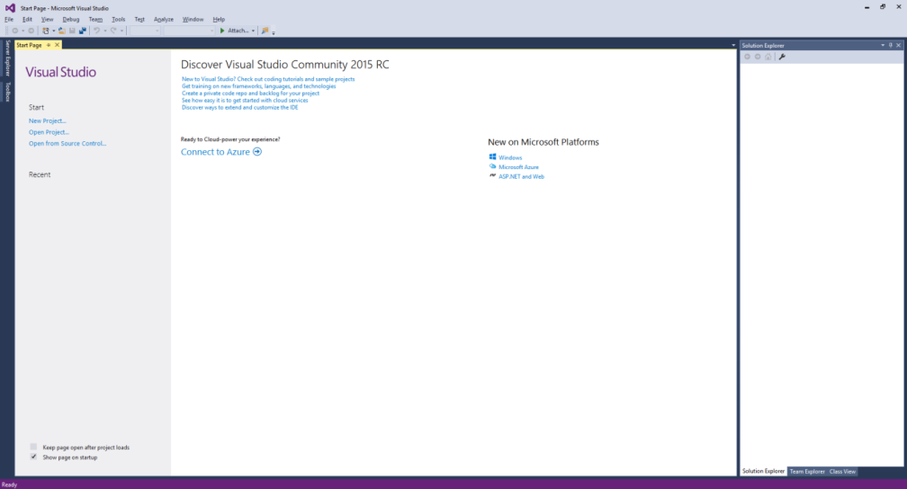
Download Visual Studio Community 2015 and install it onto your computer, if it’s already downloaded and installed select Launch to start Visual Studio Community 2015 or if it has already been downloaded and installed then start the application you may also need to Enable your device for development.
Step 2
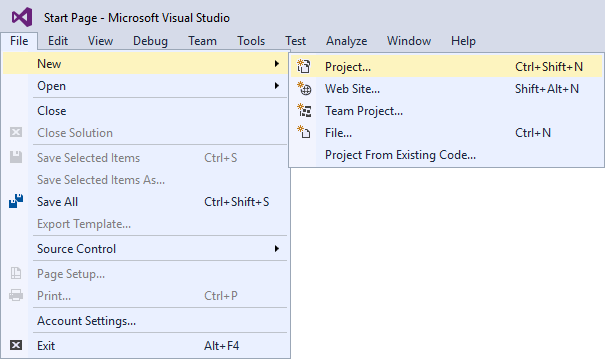
Once Visual Studio Community 2015 has started select File, then New, then Project… from the Menu.
Step 3
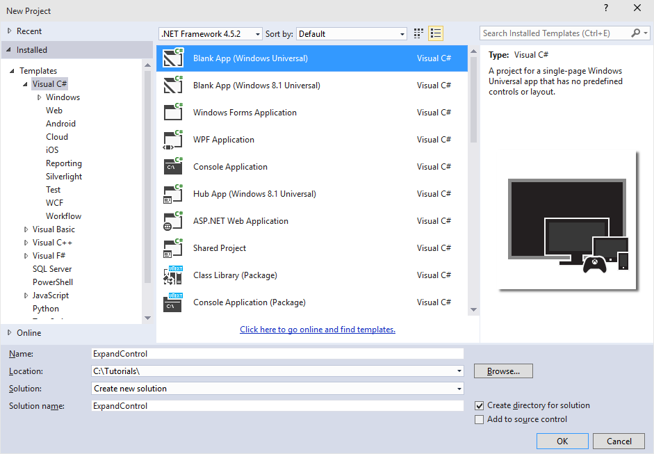
From the New Project window select Visual C# from Installed, Templates then select Blank App (Windows Universal) from the list, then type in the Name ExpandControl and select a Location to save to before selecting Ok to create the Project.
Step 4
Once done select from the Menu, Project, then Add New Item…
Step 5
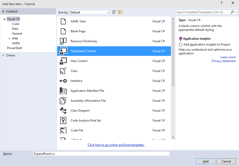
From the Add New Item window select Visual C# from Installed then select Templated Control from the list, then type in the Name as ExpandPanel.cs before selecting Add to add the file to the Project
Step 6
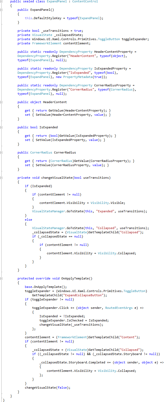
Once in the Code View for ExpandPanel.cs replace Control in public sealed class ExpandPanel : Control with ContentControl then below the public ExpandPanel() { … } the following should be entered:
private bool _useTransitions = true;
private VisualState _collapsedState;
private Windows.UI.Xaml.Controls.Primitives.ToggleButton toggleExpander;
private FrameworkElement contentElement;

public static readonly DependencyProperty HeaderContentProperty =
DependencyProperty.Register("HeaderContent", typeof(object),
typeof(ExpandPanel), null);

public static readonly DependencyProperty IsExpandedProperty =
DependencyProperty.Register("IsExpanded", typeof(bool),
typeof(ExpandPanel), new PropertyMetadata(true));

public static readonly DependencyProperty CornerRadiusProperty =
DependencyProperty.Register("CornerRadius", typeof(CornerRadius),
typeof(ExpandPanel), null);

public object HeaderContent
{
	get { return GetValue(HeaderContentProperty); }
	set { SetValue(HeaderContentProperty, value); }
}

public bool IsExpanded
{
	get { return (bool)GetValue(IsExpandedProperty); }
	set { SetValue(IsExpandedProperty, value); }
}

public CornerRadius CornerRadius
{
	get { return (CornerRadius)GetValue(CornerRadiusProperty); }
	set { SetValue(CornerRadiusProperty, value); }
}

private void changeVisualState(bool useTransitions)
{
	if (IsExpanded)
	{
		if (contentElement != null)
		{
			contentElement.Visibility = Visibility.Visible;
		}
		VisualStateManager.GoToState(this, "Expanded", useTransitions);
	}
	else
	{
		VisualStateManager.GoToState(this, "Collapsed", useTransitions);
		_collapsedState = (VisualState)GetTemplateChild("Collapsed");
		if (_collapsedState == null)
		{
			if (contentElement != null)
			{
				contentElement.Visibility = Visibility.Collapsed;
			}
		}
	}
}

protected override void OnApplyTemplate()
{
	base.OnApplyTemplate();
	toggleExpander = (Windows.UI.Xaml.Controls.Primitives.ToggleButton)
		GetTemplateChild("ExpandCollapseButton");
	if (toggleExpander != null)
	{
		toggleExpander.Click += (object sender, RoutedEventArgs e) =>
		{
			IsExpanded = !IsExpanded;
			toggleExpander.IsChecked = IsExpanded;
			changeVisualState(_useTransitions);
		};
	}
	contentElement = (FrameworkElement)GetTemplateChild("Content");
	if (contentElement != null)
	{
		_collapsedState = (VisualState)GetTemplateChild("Collapsed");
		if ((_collapsedState != null) && (_collapsedState.Storyboard != null))
		{
			_collapsedState.Storyboard.Completed += (object sender, object e) =>
			{
				contentElement.Visibility = Visibility.Collapsed;
			};
		}
	}
	changeVisualState(false);
}
It should then appear as such:
Step 7
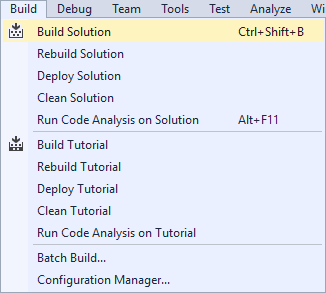
Select from the Menu, Build, then Build Solution
Step 8
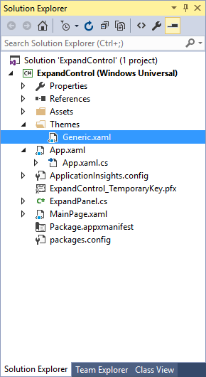
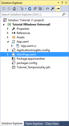
From the Solution Explorer select Generic.xaml
Step 9
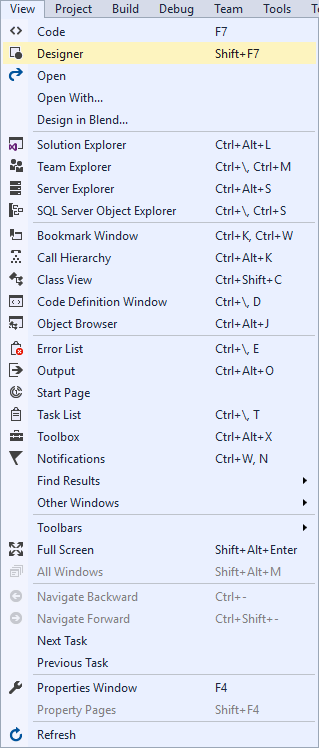
Select from the Menu, View then Designer
Step 10
Along with Design View will be the XAML View and in this remove the following XAML:
<Border
	Background="{TemplateBinding Background}"
	BorderBrush="{TemplateBinding BorderBrush}"
	BorderThickness="{TemplateBinding BorderThickness}">
</Border>
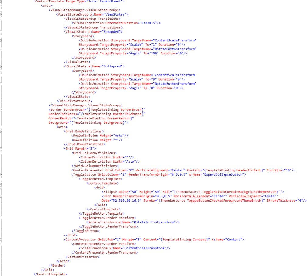
And replace with the following XAML;
<Grid>
	<VisualStateManager.VisualStateGroups>
		<VisualStateGroup x:Name="ViewStates">
			<VisualStateGroup.Transitions>
				<VisualTransition GeneratedDuration="0:0:0.5"/>
			</VisualStateGroup.Transitions>
			<VisualState x:Name="Expanded">
				<Storyboard>
					<DoubleAnimation Storyboard.TargetName="ContentScaleTransform"
					Storyboard.TargetProperty="ScaleY" To="1" Duration="0"/>
					<DoubleAnimation Storyboard.TargetName="RotateButtonTransform"
					Storyboard.TargetProperty="Angle" To="180" Duration="0"/>
				</Storyboard>
			</VisualState>
			<VisualState x:Name="Collapsed">
				<Storyboard>
					<DoubleAnimation Storyboard.TargetName="ContentScaleTransform"
					Storyboard.TargetProperty="ScaleY" To="0" Duration="0"/>
					<DoubleAnimation Storyboard.TargetName="RotateButtonTransform"
					Storyboard.TargetProperty="Angle" To="0" Duration="0"/>
				</Storyboard>
			</VisualState>
		</VisualStateGroup>
	</VisualStateManager.VisualStateGroups>
	<Border BorderBrush="{TemplateBinding BorderBrush}"
	BorderThickness="{TemplateBinding BorderThickness}"
	CornerRadius="{TemplateBinding CornerRadius}"
	Background="{TemplateBinding Background}">
		<Grid>
			<Grid.RowDefinitions>
				<RowDefinition Height="Auto"/>
				<RowDefinition Height="*"/>
			</Grid.RowDefinitions>
			<Grid Margin="3">
				<Grid.ColumnDefinitions>
					<ColumnDefinition Width="*"/>
					<ColumnDefinition Width="Auto"/>
				</Grid.ColumnDefinitions>
				<ContentPresenter Grid.Column="0" VerticalAlignment="Center" Content="{TemplateBinding HeaderContent}" FontSize="16"/>
				<ToggleButton Grid.Column="1" RenderTransformOrigin="0.5,0.5" x:Name="ExpandCollapseButton">
					<ToggleButton.Template>
						<ControlTemplate>
							<Grid>
								<Ellipse Width="50" Height="50" Fill="{ThemeResource ToggleSwitchCurtainBackgroundThemeBrush}"/>
								<Path RenderTransformOrigin="0.5,0.5" HorizontalAlignment="Center" VerticalAlignment="Center"
								Data="M2,3L9,10 16,3" Stroke="{ThemeResource ToggleButtonCheckedForegroundThemeBrush}" StrokeThickness="4"/>
							</Grid>
						</ControlTemplate>
					</ToggleButton.Template>
					<ToggleButton.RenderTransform>
						<RotateTransform x:Name="RotateButtonTransform"/>
					</ToggleButton.RenderTransform>
				</ToggleButton>
			</Grid>
			<ContentPresenter Grid.Row="1" Margin="5" Content="{TemplateBinding Content}" x:Name="Content">
				<ContentPresenter.RenderTransform>
					<ScaleTransform x:Name="ContentScaleTransform"/>
				</ContentPresenter.RenderTransform>
			</ContentPresenter>
		</Grid>
	</Border>
</Grid>
It should appear as such:
Step 11
Then select from the Menu, Build, then Build Solution
Step 12
From the Solution Explorer select MainPage.xaml
Step 13
Select from the Menu, View then Designer
Step 14
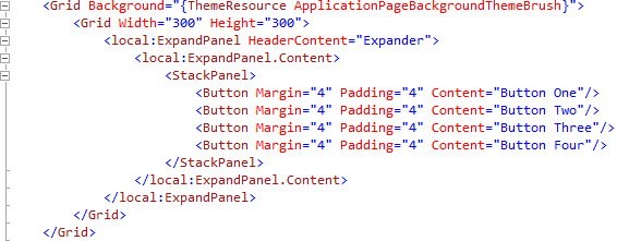
The Design View will be displayed along with the XAML View and in this below <Grid Background=”{ThemeResource ApplicationPageBackgroundThemeBrush}”> enter the following XAML:
<Grid Width="300" Height="300">
	<local:ExpandPanel HeaderContent="Expander">
		<local:ExpandPanel.Content>
			<StackPanel>
				<Button Margin="4" Padding="4" Content="Button One"/>
				<Button Margin="4" Padding="4" Content="Button Two"/>
				<Button Margin="4" Padding="4" Content="Button Three"/>
				<Button Margin="4" Padding="4" Content="Button Four"/>
			</StackPanel>
		</local:ExpandPanel.Content>
	</local:ExpandPanel>
</Grid>
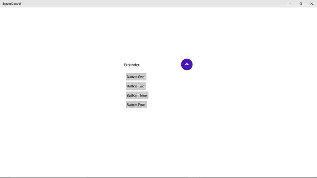
It should appear as such:
Step 15
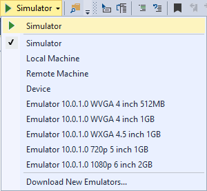
That completes the Windows Universal Application so Save the Project then select the Debug and Simulator option to run the Application
Step 16
Once the Simulator has started the Application should then appear with the Flip Panel displayed which can be expanded or contracted when highlighted button on top is tapped
Step 17
To Exit the application select Stop Debugging in Visual Studio Community 2015
Step 18
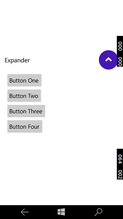
Another option is to run as a Windows Phone application, select Debug and select Emulator 10.0.1.0 WVGA 4 inch 512MB option to run the Application
Step 19
Once the Emulator has started the Application should then appear with the Flip Panel displayed which can be expanded or contracted when highlighted button on top is tapped
Step 20
To Exit the application select Stop Debugging in Visual Studio Community 2015




When is “private bool _useTransitions = true;” ever set to “false”?
LikeLike
Indeed it isn’t but would allow the toggling of the transition on or off if it was changed to false in the code or with another added property
LikeLike
Could you upload the source? Could not get this one to work 😦
LikeLike
Sorry you’ve not got that one to work, the source is available at https://github.com/RoguePlanetoid/Windows-10-Universal-Windows-Platform-Tutorials
LikeLike
Thank you very much,
it works flawlessly
LikeLike
This work fine. Thanks.
But there must be animation when expand and collapse. Plz put the animations and update the post and repo.
For reference see this gif. http://i.stack.imgur.com/Kynnk.gif
LikeLike
I think there are basic animations but the gif looks better – the examples were designed to be added to, so good to see this being done
LikeLike
The project on GitHub is downloaded but missing some reference when extracting and is not running. plz update it.
LikeLike
The examples are from older version that were upgraded so could be causing problem with references, it shouldn’t need more than the usual ones so let me know which ones it’s complaining about and I’ll see if that is the case
LikeLike
Sir, There is no property of Content, I mean is missing. Its not getting the Content property. plz help.
LikeLike
There should be I think it’s a property of Content Control normally, make sure are extending ContentControl in the class
LikeLike
Hi,
Thanks for this article !
I’did copy the code to my UWP Project but I have a problem with where Content is not available in the IntelliSense and also during build… Di I miss Something ?
Thanks for your feedback !
LikeLike
I Apologize !
You’re right. I forgot to change the Control to ContentControl !
Forget that 😉
LikeLike
That’s okay – it’s easy to miss that change, done that sort of thing myself before!
LikeLike
Great article – it was exactly what I was looking for so thanks very much for sharing.
LikeLike
nice article.. but i have a small doubt.. if i have two expanders in one grid, then if i am expanding one expander then it is working fine, and at the same time if i am expanding second one first expander also in expanded state, but it should be collapsed. i.e., at one time only one should be expanded and other one should be in collapsed state. How it will be done?
Please help me on that. Thank you.
LikeLike