Custom Toggle demonstrates how to create a custom Style for a ToggleSwitch Control
Step 1
If not already, follow Setup and Start on how to Install and get Started with Visual Studio 2017 or in Windows 10 choose Start, and then from the Start Menu find and select Visual Studio 2017.

Step 2
Once Visual Studio Community 2017 has started, from the Menu choose File, then New then Project…

Step 3
From New Project choose Visual C# from Installed, Templates then choose Blank App (Universal Windows) and then type in a Name and select a Location and then select Ok to create the Project

Step 4
Then in New Universal Windows Project you need to select the Target Version this should be at least the Windows 10 Fall Creators Update (10.0; Build 16299) and the Minimum Version to be the same.

The Target Version will control what features your application can use in Windows 10 so by picking the most recent version you’ll be able to take advantage of those features. To make sure you always have the most recent version, in Visual Studio 2017 select Tools Extensions and Updates… then and then see if there are any Updates
Step 5
Once the Project is created from the Solution Explorer select App.xaml

Step 6
From the Menu choose View and then Designer

Step 7
Once in the Design View for App.xaml between the Application and /Application elements the following should be entered:
<Application.Resources>
	<Style x:Key="CustomToggle" TargetType="ToggleSwitch">
		<Setter Property="Background" Value="LightSalmon"/>
		<Setter Property="BorderBrush" Value="Salmon"/>
		<Setter Property="Foreground" Value="Gold"/>
		<Setter Property="ManipulationMode" Value="System,TranslateX"/>
		<Setter Property="UseSystemFocusVisuals" Value="True"/>
		<Setter Property="Template">
			<Setter.Value>
				<ControlTemplate TargetType="ToggleSwitch">
					<Grid HorizontalAlignment="Center">
						<VisualStateManager.VisualStateGroups>
							<VisualStateGroup x:Name="ToggleStates">
								<VisualStateGroup.Transitions>
									<VisualTransition x:Name="DraggingToOnTransition" From="Dragging" GeneratedDuration="0" To="On">
										<Storyboard>
											<RepositionThemeAnimation FromHorizontalOffset="{Binding
											TemplateSettings.KnobCurrentToOnOffset,
											RelativeSource={RelativeSource Mode=TemplatedParent}}"
											TargetName="SwitchKnob"/>
										</Storyboard>
									</VisualTransition>
									<VisualTransition x:Name="DraggingToOffTransition" From="Dragging" GeneratedDuration="0" To="Off">
										<Storyboard>
											<RepositionThemeAnimation FromHorizontalOffset="{Binding
											TemplateSettings.KnobCurrentToOffOffset,
											RelativeSource={RelativeSource Mode=TemplatedParent}}"
											TargetName="SwitchKnob"/>
										</Storyboard>
									</VisualTransition>
									<VisualTransition x:Name="OnToOffTransition" From="On" GeneratedDuration="0" To="Off">
										<Storyboard>
											<RepositionThemeAnimation FromHorizontalOffset="{Binding
											TemplateSettings.KnobOnToOffOffset,
											RelativeSource={RelativeSource Mode=TemplatedParent}}"
											TargetName="SwitchKnob"/>
										</Storyboard>
									</VisualTransition>
									<VisualTransition x:Name="OffToOnTransition" From="Off" GeneratedDuration="0" To="On">
										<Storyboard>
											<RepositionThemeAnimation FromHorizontalOffset="{Binding
											TemplateSettings.KnobOffToOnOffset,
											RelativeSource={RelativeSource Mode=TemplatedParent}}"
											TargetName="SwitchKnob"/>
										</Storyboard>
									</VisualTransition>
								</VisualStateGroup.Transitions>
								<VisualState x:Name="Dragging"/>
								<VisualState x:Name="Off"/>
								<VisualState x:Name="On">
									<Storyboard>
										<DoubleAnimation Duration="0" To="24" Storyboard.TargetProperty="X"
										Storyboard.TargetName="KnobTranslateTransform"/>
										<ObjectAnimationUsingKeyFrames Storyboard.TargetProperty="Opacity"
										Storyboard.TargetName="SwitchKnobBounds">
											<DiscreteObjectKeyFrame KeyTime="0" Value="1"/>
										</ObjectAnimationUsingKeyFrames>
										<ObjectAnimationUsingKeyFrames
										Storyboard.TargetProperty="Opacity"
										Storyboard.TargetName="SwitchKnobOn">
											<DiscreteObjectKeyFrame KeyTime="0" Value="1"/>
										</ObjectAnimationUsingKeyFrames>
										<ObjectAnimationUsingKeyFrames
										Storyboard.TargetProperty="Opacity"
										Storyboard.TargetName="SwitchKnobOff">
											<DiscreteObjectKeyFrame KeyTime="0" Value="0"/>
										</ObjectAnimationUsingKeyFrames>
									</Storyboard>
								</VisualState>
							</VisualStateGroup>
						</VisualStateManager.VisualStateGroups>
						<Rectangle x:Name="OuterBorder" Height="30" Width="55" RadiusY="15" RadiusX="15"
						StrokeThickness="1" Stroke="{TemplateBinding BorderBrush}" Fill="{TemplateBinding Background}"/>
						<Rectangle x:Name="SwitchKnobBounds" Height="30" Width="55" RadiusY="15" RadiusX="15"
						StrokeThickness="1" Stroke="Goldenrod" Fill="{TemplateBinding Foreground}" Opacity="0"/>
						<Grid x:Name="SwitchKnob" Grid.Row="2" HorizontalAlignment="Left" Height="25" Width="30">
							<Grid.RenderTransform>
								<TranslateTransform x:Name="KnobTranslateTransform"/>
							</Grid.RenderTransform>
							<Ellipse x:Name="SwitchKnobOn" Height="15" Width="15"
							Fill="{TemplateBinding Background}" Opacity="0"/>
							<Ellipse x:Name="SwitchKnobOff" Height="15" Width="15"
							Fill="{TemplateBinding Foreground}"/>
						</Grid>
						<Thumb x:Name="SwitchThumb" AutomationProperties.AccessibilityView="Raw">
							<Thumb.Template>
								<ControlTemplate TargetType="Thumb">
									<Rectangle Fill="Transparent"/>
								</ControlTemplate>
							</Thumb.Template>
						</Thumb>
					</Grid>
				</ControlTemplate>
			</Setter.Value>
		</Setter>
	</Style>
</Application.Resources>
In the App.xaml there is a CustomToggle resource Style declared and it is a customised copy of the default ControlTemplate for a ToggleSwitch Control with the colours customised like the other Custom Controls.
Step 8
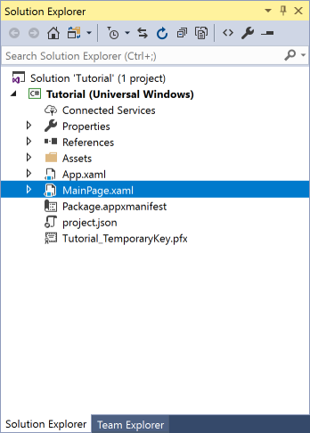
In the Solution Explorer select MainPage.xaml
Step 9
From the Menu choose View and then Designer
Step 10
The Design View will be displayed along with the XAML View and in this between the Grid and /Grid elements, enter the following XAML:
<ToggleSwitch VerticalAlignment="Center" HorizontalAlignment="Center" Style="{StaticResource CustomToggle}"/>
The block of XAML represents the CheckBox Control with the Style of the the CustomCheckbox.
Step 11
That completes the Universal Windows Platform Application so Save the Project then in Visual Studio select the Local Machine to run the Application

Step 12
After the Application started running you can tap the ToggleSwitch to switch between On or Off in the Application

Step 13
To Exit the Application select the Close button in the top right of the Application

 Comentsys